French House: The Salon
The Salon. That’s the living room to you and I. And somehow to date, my least successful room of the the French house. I have found it a tricky room to really nail - lets get into why and what I’ve done to date.
the basics of the room - layout and architectural details
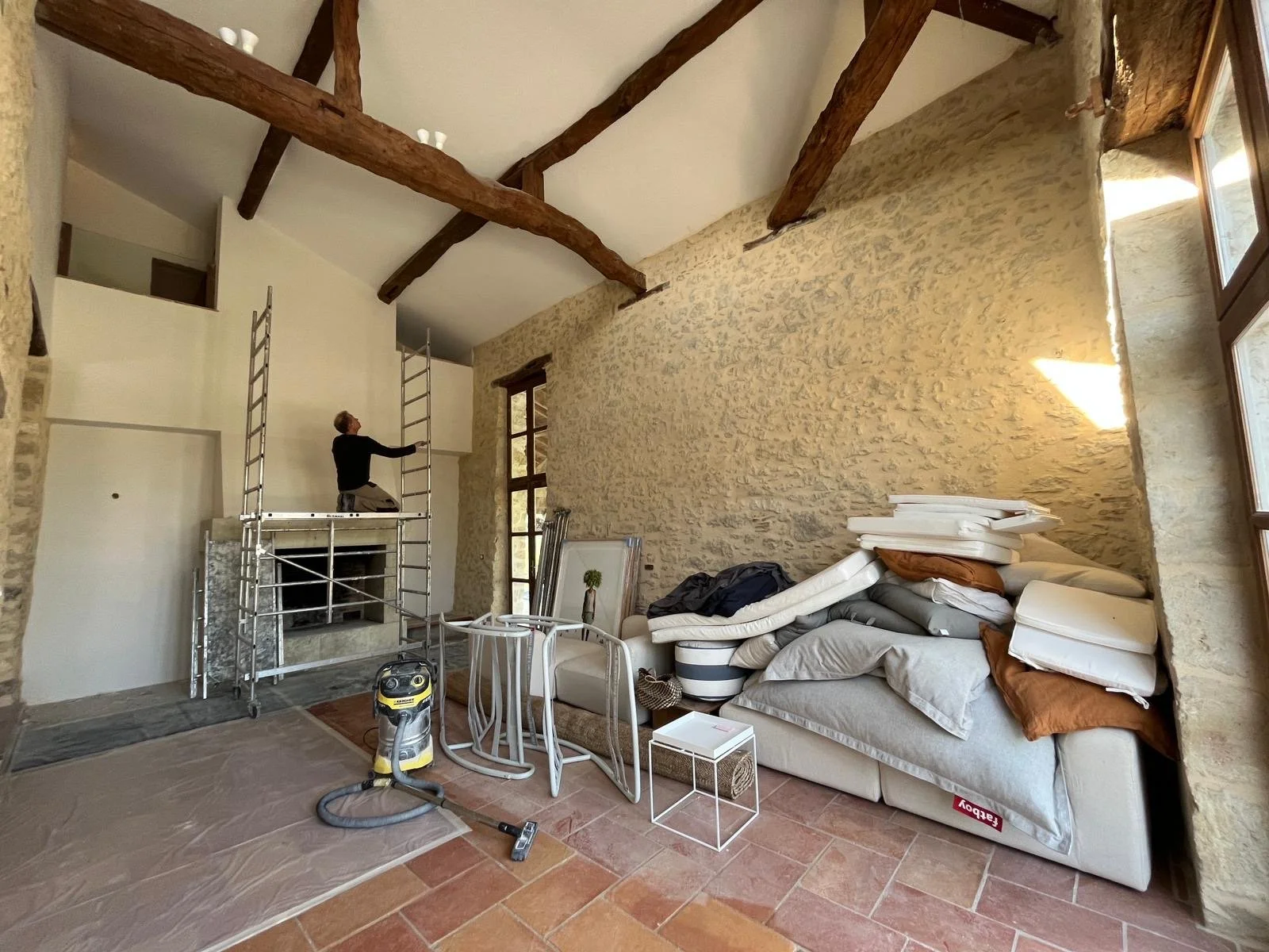
This room sits at the back of the house with the wide outdoor terrace leading off it through a set of glass doors (which are almost full height with glass windows above). On the short sides of the room there is a huge stone fire place and facing this, a wall that is almost entirely a set of glass doors that leads to another outdoor paved area. The room is double height and would have originally been a section of the barn (hence, the high high ceilings). Unlike the sejour which is in the original farmhouse section of the house and whose ceiling beams sit really quite low, the ceiling beams in this room are a number of meters above. The room has a loft like quality. It is long and narrow and it is also overlooked from above.
When the house was originally converted from house and connecting barn into just one big house, the barn section was divided on the ground floor into this room plus the kitchen which adjoins, and then a second story was added above. Upstairs there are two bedrooms, a bathroom, an office room and a roof terrace. I’m not entirely sure why, but the small corridor that leads to one of the upstairs bedrooms has a half height glass wall so that you can look down on the salon from above. I find it weird. I wouldn’t have added this design feature - but this is what we’ve inherited.
All this to say, for a room that has a small footprint it has a lot going on architecturally to contend with.
what did this room look like when we bought the house?
Style wise this room was a shambles - odd mismatching furniture, scale and proportion out of whack and in general just very very tired. It felt strangely formal and also chaotic. The large carpet hung on the wall overwhelms the narrow room and gives it a dark almost oppressive feel. You can see how it looked in the video below…
The room in its original state - the timber was still unpainted so everything felt very brown.
Old lighting, only one bench beside fireplace and glass wall overlooking the room
Weird old doorways with 'windows' through to kitchen
first things first
So we’ve established this room was kind of tricky from a traffic flow, footprint point of view. But the piece de resistance were the cut outs in the wall that lead to the kitchen. I assume these would have once been doorways within the barn. For some reason when the owners converted the barn they decided to leave these door sized gaps in the wall. It meant that from the kitchen you had a kind of window opening to look down on the salon. The bottom half of this opening had been used to create a narrow shelf in the salon itself from random off cuts of the black quartz kitchen bench top. From a design perspective, I found the whole thing disturbing. So, first things first - I needed to find a solution to these weird doorway niches.
Initially I thought I would just fill in these doorways
Year one and I needed to figure this out
the solution
It took some time to ponder this one. In the end I decided I would expand the niches and turn them into one wide media niche. I originally debated filling them in with stone so that we had a complete wall to work with but then I realised we needed somewhere to put a TV and we also wanted a bookshelf for books, photo frames and decoration. So rather than fill in the original door sized niches, I had the stone wall between them knocked out. A long wooden plinth was inserted in the wall above the new wider media niche and thick plaster shelves were created so that the shelves and the internal niche was all uniformed and finished in one look.
When the media niche was initially built and the shelves created (despite having provided a design) they only included two shelves and positioned them equal distance apart. I had to have it redone to my original design which had three shelves - two closer together with a bigger gap for the TV.
More books and objects needed but these will be added over time. Plus I need to figure out hiding the cords of the Apple TV and the electricity ports need their fronts put back on. Lastly, I will fill in the bottom 'shelf' to finish the look of the niche.
does it work?
On balance, I would say yes. It was the best solution for this room both from a design and practical point of view. This really is quite a narrow room so adding in a tv cabinet would have used up floor space. The media niche allowed us to wall mount the TV and do away with an unnecessary piece of furniture. But, it still doesn’t feel quite right. We are slowly building up the number of books that are at the French house - there are only so many books that we can take each year, and we’ve only been twice since this media niche was completed. So, we need quite a bit more on the shelves and in time that will come. I have also decided to fill in the bottom of the niche - it was left open and it feels unfinished to me, so I have added this to the list of tasks in the coming year. I think this will help it to feel finished.
what else?
The other element that has slightly transformed this room but is maybe tricky to appreciate in the photos, is that we had the stone walls repointed. Whereas they were originally quite grey in colour and the stone was very uneven, they are now a softer slightly more even creamy colour. Initially I didn’t like the change but it’s grown on me and I can see that the room is now overall lighter and feels a little more fresh. Painting all the timber work and replastering and painting the fireplace wall has also helped significantly. See post here for these house wide changes.
furniture choices
the sofa - looks pretty, but is a fail for me
When I was designing this room from afar I had a vision for this room where we had a low modular sofa that provided a comfortable lounge-y look whilst also being streamlined and contemporary. I fell in love with the curves of this sofa and its low profile. Perfect. Hmm. I am sorry to say it was a fail (for me). When I unpacked it my heart skipped a beat, we set it up in the room and it looked just as I wanted it to - and then I sat on it. My heart sank. I didn’t find it comfortable. This is always a risk when buying sofas or armchairs sight unseen. Is it comfortable?? Who the hell would know until you sit on it. Its low back and deep seat mean I kind of can’t get comfy on it - which is really disappointing. My husband is not even remotely entertaining the idea that we get a different sofa (I have subtlety tried to insert the idea into the conversation and there have been no bites. So seems like the sofa is staying despite my discomfort). I should also note that no one else in the family seems to really find it uncomfortable, when I push them and say “but don’t you find it so uncomfortable?” their response is more a “umm, yeah…maybe a little? I hadn’t really thought about it”. Cue eye roll from me. I’ve thought about it. Endlessly. I find it uncomfortable. So this summer I spent time figuring out where the comfort factor was going wrong and how I might be able to fix it. It amounts to this - I need to make some new slightly higher back cushions to give more support to the lean back - and where the current back cushions are filled with feather (and therefore slouch down as soon as you lean back) I will have the new cushion inserts be a polyester filling that is more robust and will yield but hold their shape. That’s the plan.
coffee table - looks ok, but isn’t quite right
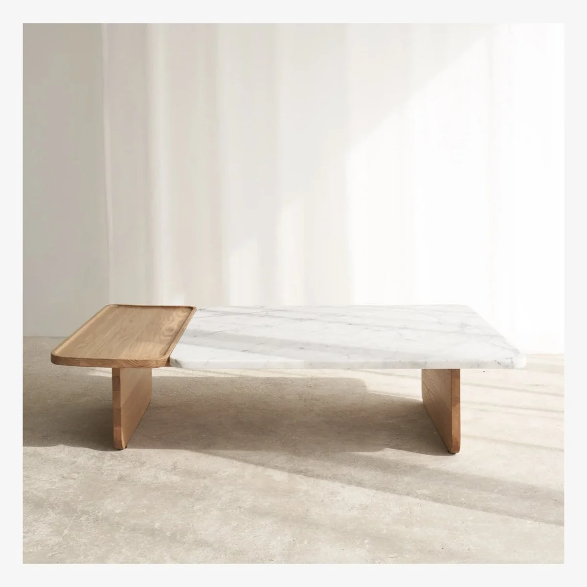
Next up the coffee table - this was a bit of a quick decision purchase in our first summer because honestly the whole room was so empty and we kind of wanted to just move things along. In hindsight it wasn’t a great choice. It’s fine. But somehow its scale is wrong. It feels too insignificant in the space - I needed to have chosen something with more heft. The curves of the design are a nice complement to the curves of the sofa, so that’s a positive, but otherwise I feel like I could have done something more interesting here. It feels too bland and boring. (But see above for husbands appetite for changing something we’ve bought that is not quite right in my eyes only = not going to happen). This piece is staying. Sigh.
artwork - a win
I bought these two limited edition photography pieces for the room before I’d ever seen the house. They were literally the very first thing I bought for the house. Even so, it took 3 summers before they were hung - getting a French tradesman to tackle hanging these heavy pieces on an uneven stone wall was a feat. No one seemed game. But this summer, we arrived and they were up and I’m so happy. They have been hung a bit low, but I’m prepared to look past this because they are up. Hallelujah! Large scale photography is a great affordable way to create impact with art. I knew this room would need something significant on the wall and I wanted it to feel modern and fresh and a bit unexpected.
the fireplace stays
Unlike the sejour where we removed the fireplace and crappy surrounds, in this room the fireplace stays. This is a far nicer stone fireplace with proper solidity and lends the room a traditional feel which I love against the more contemporary elements we’ve added in. As with every other non-stone wall in the house, this wall was smooth rendered and painted in Farrow & Ball ‘strong white’ to freshen it up. I have also added another timber seated bench to the side that didn’t have one. Next up I will have mattress tops made for these benches. Stay tuned.
lighting gets an upgrade
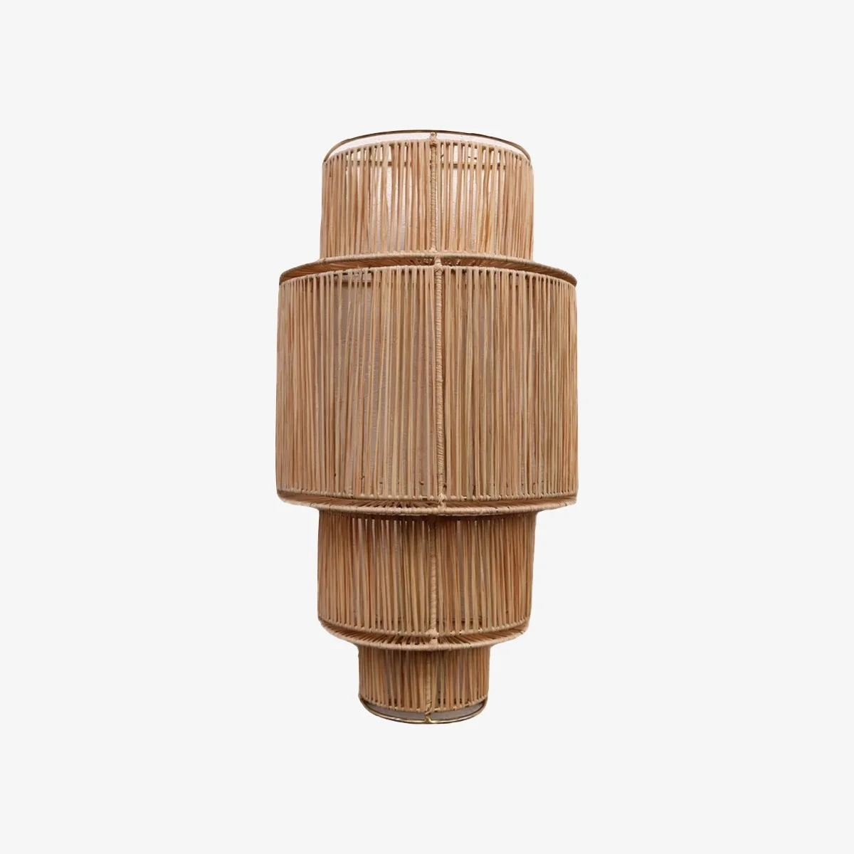
Clearly I wasn’t going to keep the existing wall lights (they were the same as the ones in the sejour) and in here I decided to replace them with woven ones from Honore Deco. Their size is exactly right for the space and when on, they emit a beautiful soft glow. I also love the textural element that they add to the space especially against the clean smooth white of the wall. They have a summer feel and are perfect for the room (thank goodness I got something right!)
next steps
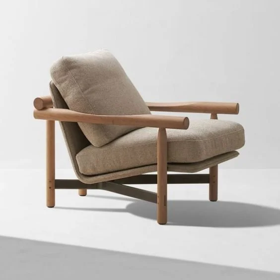
My next steps in here are all pretty simple but may take me some time (you know I’m not a fan of rushing things). I have been on the hunt for a while for some armchairs to add into the seating - I’ve had some ideas but given the misstep with the uncomfortable sofa I am taking my time on this. I will also have some mattress cushions for the bench seating in a pattern and add either a bolster or a couple of cushions against the wall as well. I also need to add some sheer linen drapes to the expanse of doors.
SOUREBOOK
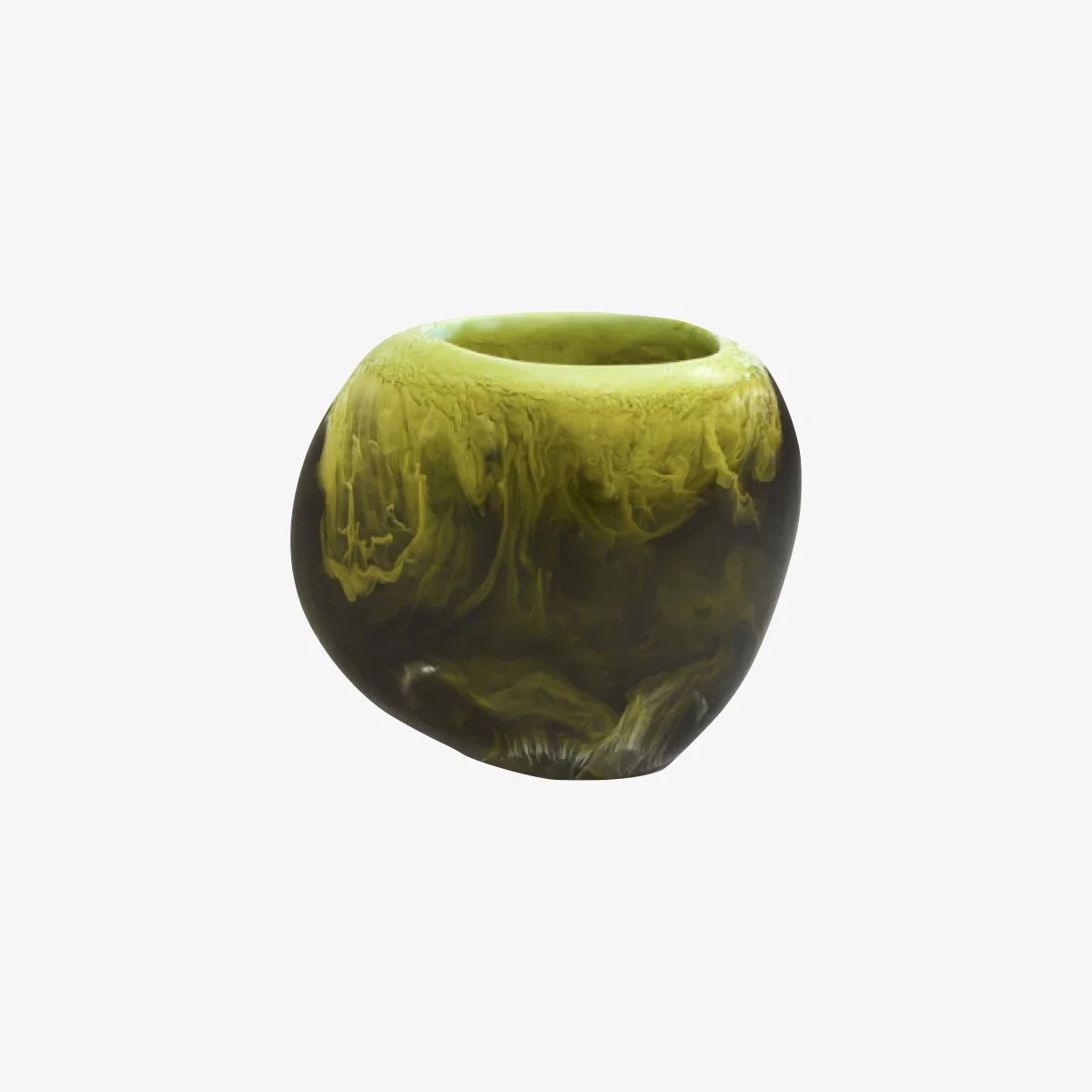
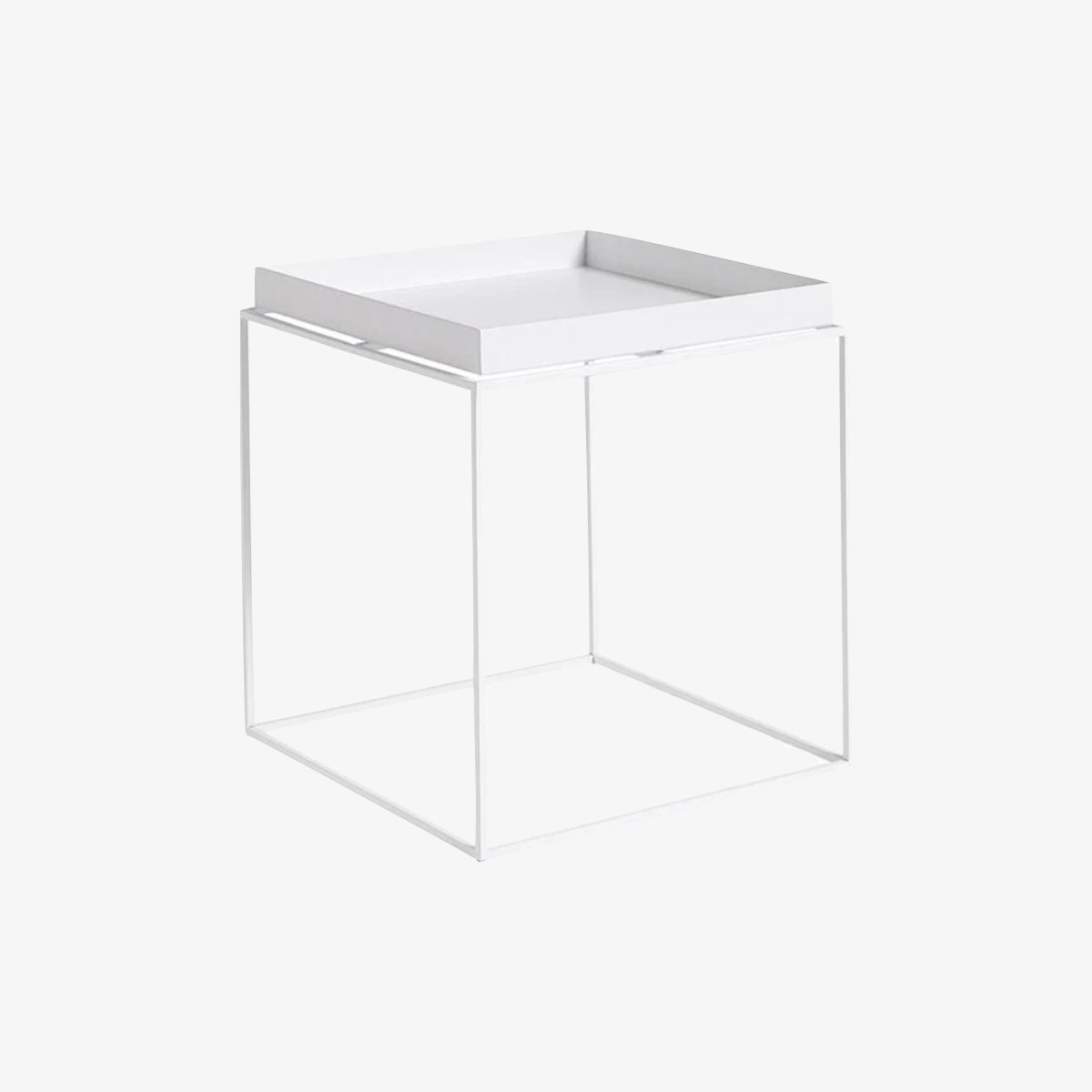
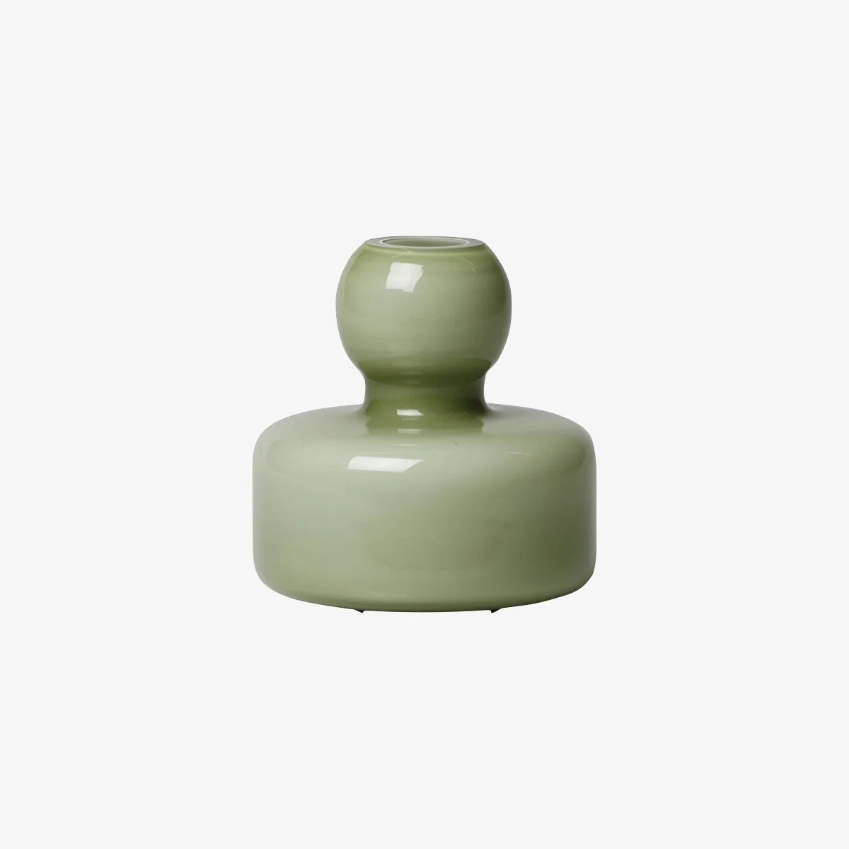
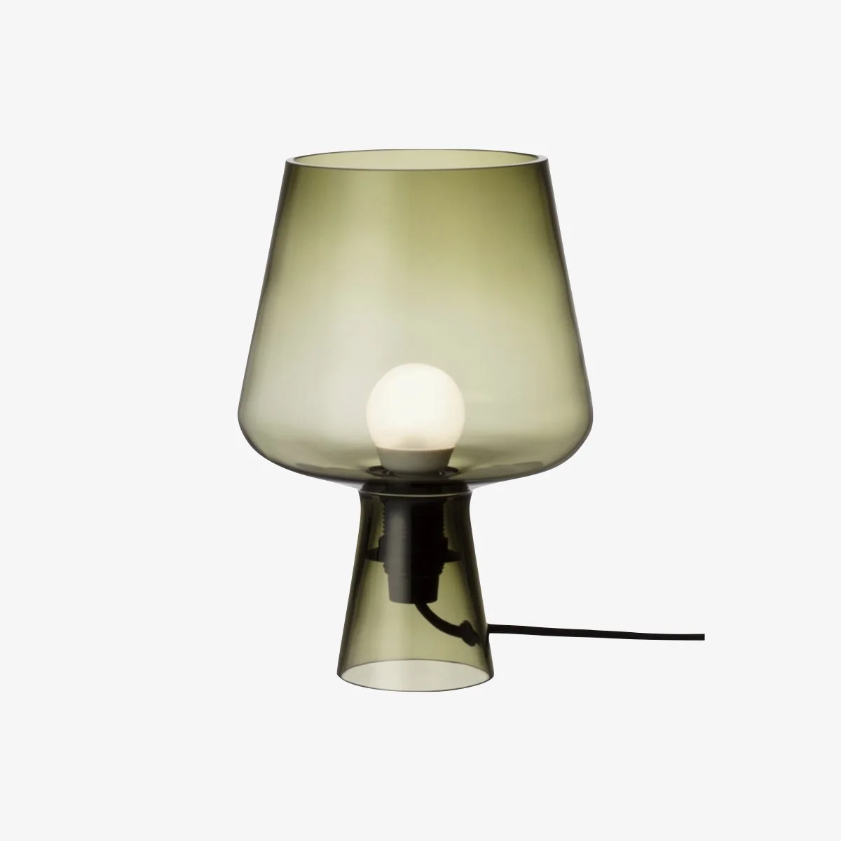
Items that I bought or similar items to ones I bought that you might like too. Click on the image below to be taken to the product.
INSPIRATION
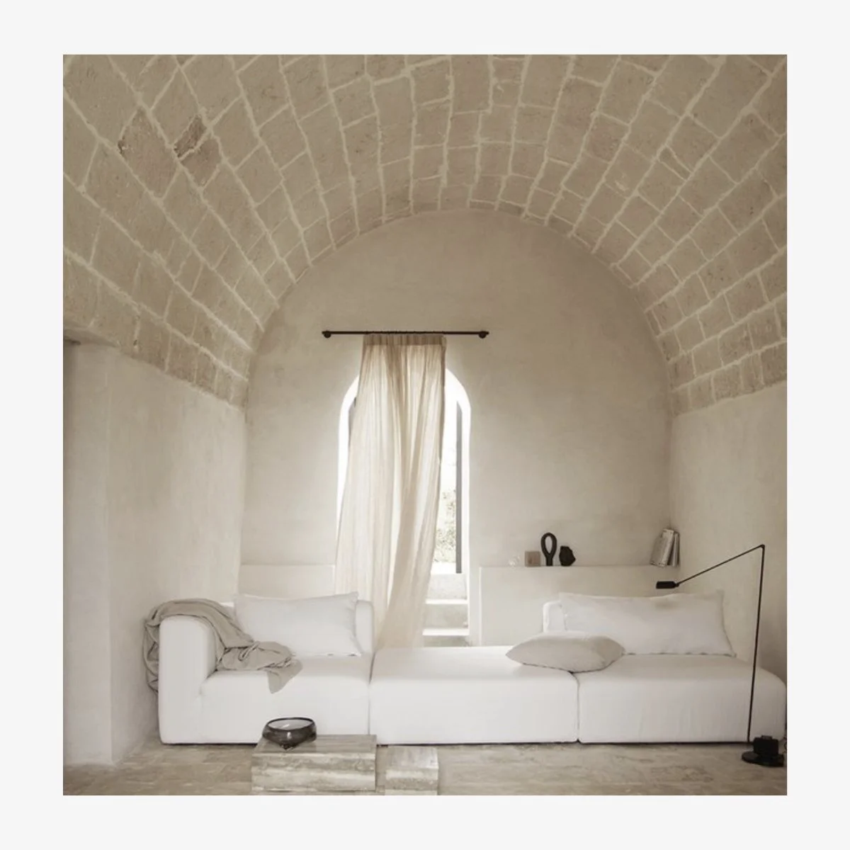
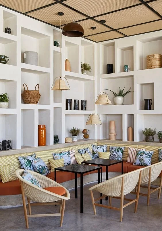
Here are some pins that I saved while looking for inspiration. Some of these images are saved for pattern, colour or treatment of a space and just help to gather ideas and serve as inspiration.


