How a Couple of Changes Transformed our Living Room
A year ago I posted an article about revamping our living room. It had been a good many years since our living room had seen any attention and in that time some of our pieces, mainly the sofas and rug, had tipped from being grotty - but kind of acceptable - to being in total need of replacing. At the time I debated changing the pendant light and considered a new colour palette. Even though I wasn’t doing a complete overhaul - just a revamp - before I hit the shops and started purchasing, I created a moodboard (see below).
To make successful interior styling changes in your home, I highly recommend this as step one in the process. It helps to visualise your ideas and create focus around the changes you will make. I do mood boards even for small changes - like introducing a new colour palette, and I find that through the process of creating a moodboard, I am also conducting some research at the same time around products that might work in the space and that I might consider for purchase.
HOW TO MAKE A DIGITAL MOODBOARD
Open a blank page in Powerpoint or Keynote.
Find images online that either represent the kind of item you are wanting to include - or if possible, find an image of the actual item.
Take a screenshot of the item and drag it onto your blank moodboard page. Then remove the background to the image so that you have a ‘cut out’ of the item. That way you won’t have distracting elements on your page.
Include on your moodboard existing items that will stay in the room. In my example I was only looking at changing the sofa and rug and considering a new accent colour palette. So I inserted my existing side table, Hans Werner chair, pendant light and a piece of marble to represent my coffee table. These were the elements I planned on keeping.
Place the items together on the page so you can see how the various elements might interact with each other in a real life situation.
Try and keep scale in mind - resize the sofa so it is bigger than the side table etc. That way you can roughly gauge the mix of materials and colour in the overall scheme.
WHAT DID OUR LIVING ROOM LOOK LIKE PRE-MAKEOVER?
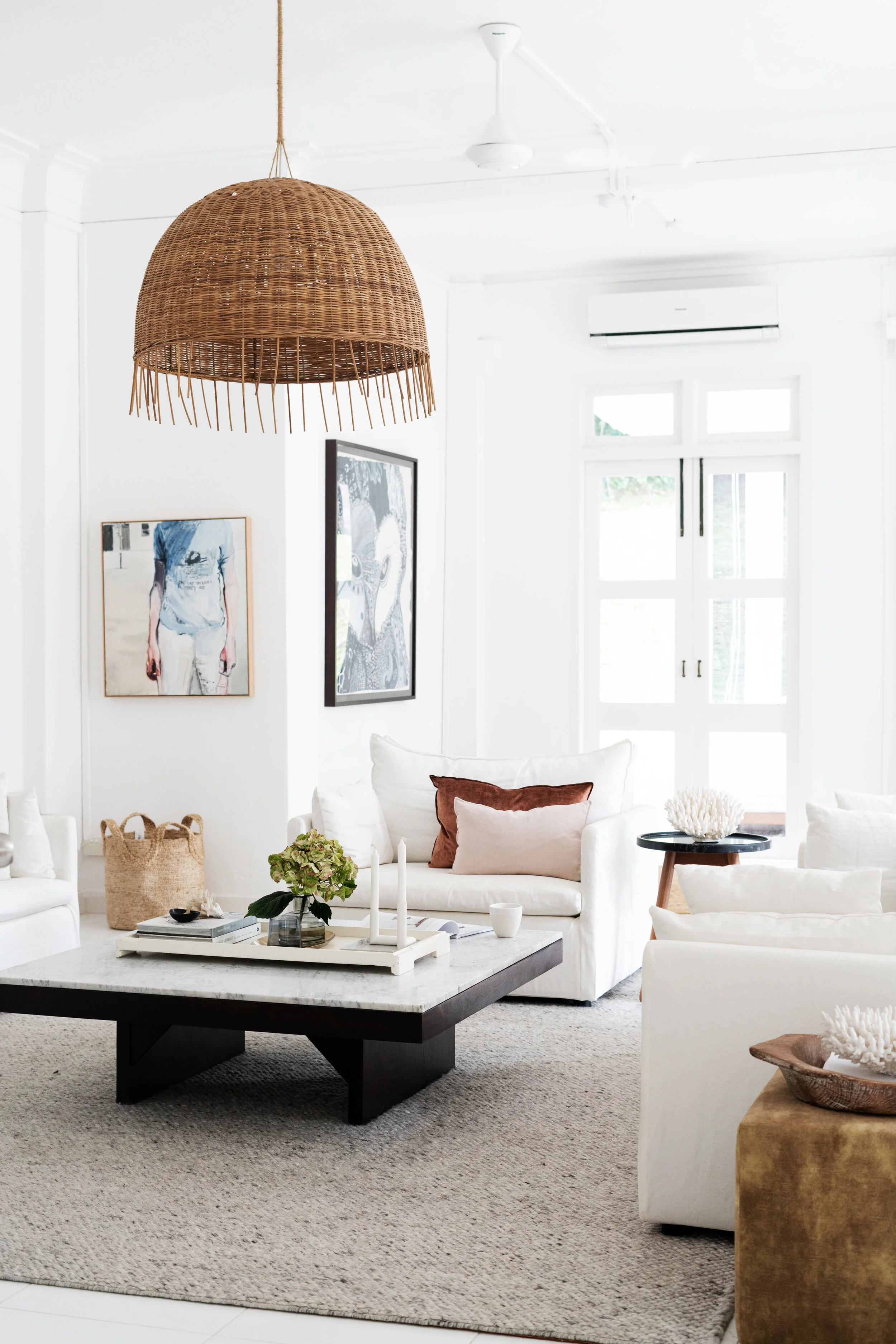
Before the new white sofas, we had charcoal grey ones. They had a slight mid-century aesthetic which I adored, but the button-through seat cushions were a bad choice because I couldn't remove the covers to clean them - not ideal for a family with small(ish) children. The rug was a wool dhurrie in a pale grey and white chevron - which was very on trend at the time I bought it. In hindsight this wasn’t a good choice. Even though we had it for many years, the design of it dated very quickly and in truth I was probably sick of it long before it needed replacing due to wear and tear.
BEFORE
some of the smaller changes…
I switched out the small Martine Emdur painting for one that had previously been in my bedroom. The scale of the new artwork works better with the large scale Joshua Yeldham piece hanging on the adjacent wall.
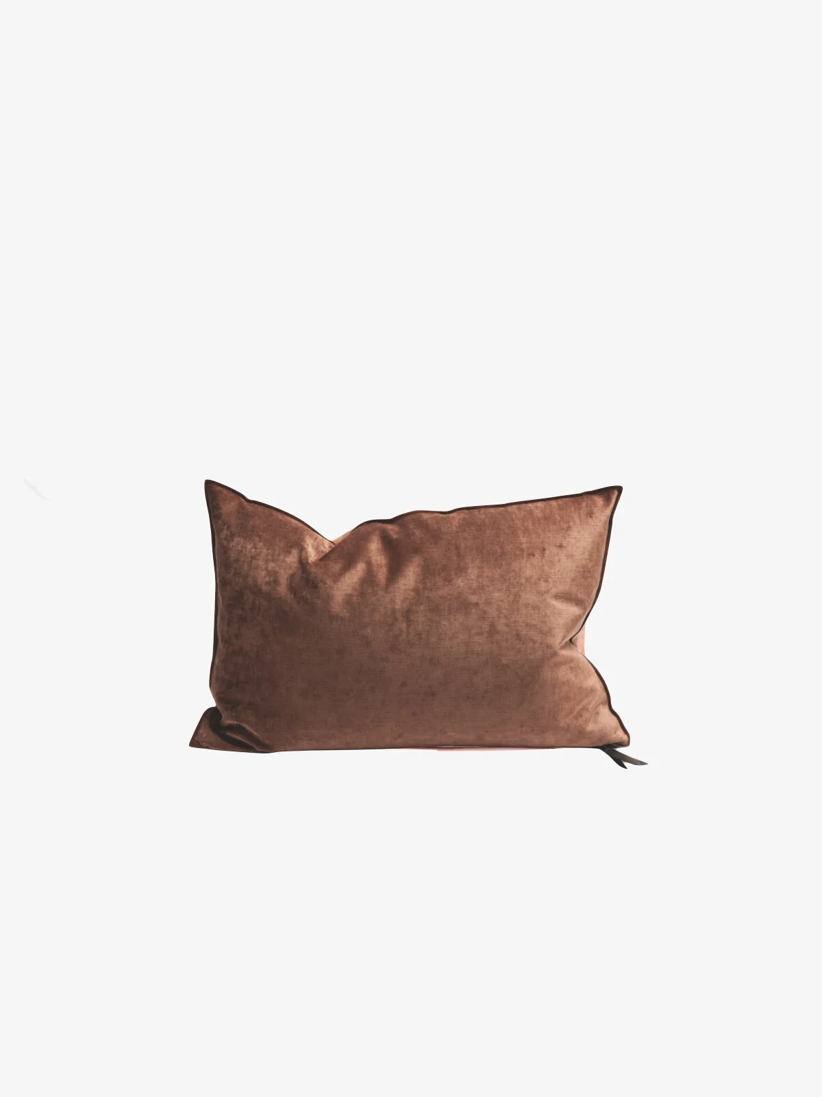
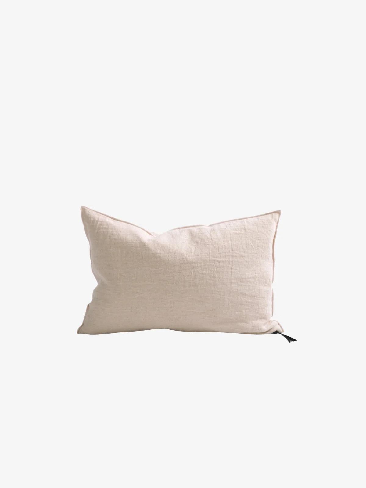
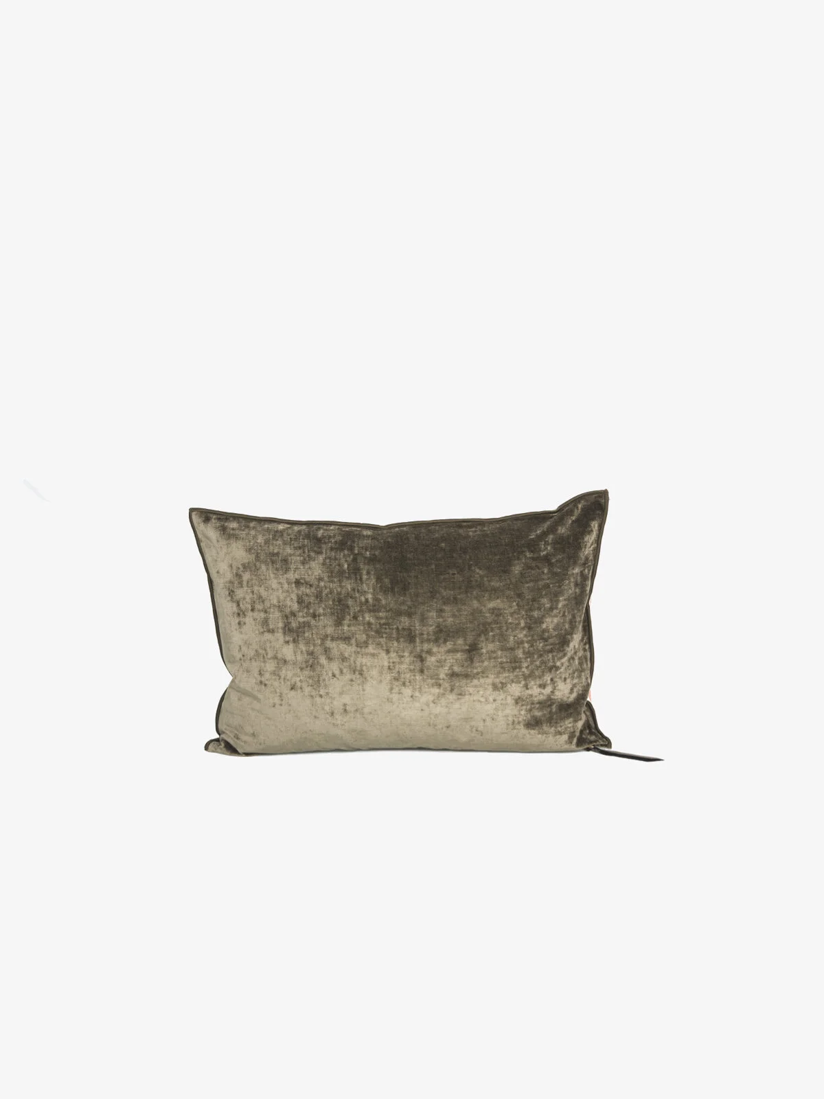
I shifted the colour palette away from blues. They were a good choice for the charcoal grey, but with the new artwork in place I didn’t want everything to feel too “one note” so I used clay, pale pink and butterscotch instead.
AFTER
LIVING WITH WHITE SOFAS - DOES IT WORK with a family?
At the time we bought the charcoal grey sofas we had very little kids (a baby and a toddler) so I was grateful for the dark colour which hid almost all the sins. However, now that we have white linen slip cover sofas, I’m not sure I will ever go back to the dark side. The white shows everything, true. But as long as you can remove the covers and wash them, it’s OK - and I like that I can see when they are getting a bit dirty. Whereas with the grey I really had no idea until it was beyond reasonable. In general the white sofas are fairly easy to keep looking good. We throw them in the washing machine on a normal cycle with no special treatment about once every 6-8 weeks. The spot where my youngest sits gets the dirtiest first - probably that one little corner of the sofa could be washed every week! - but in general keeping them clean is not a major issue.
choosing the correct rug size
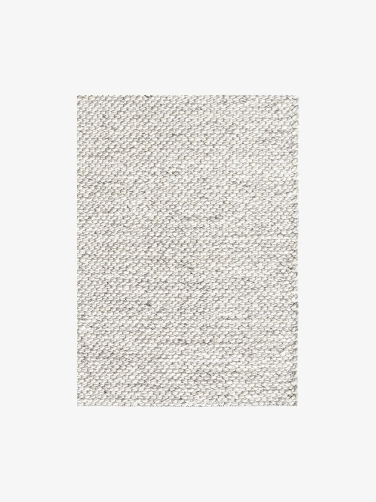
Our previous chevron rug was a custom made 4 x 4m. It meant that both the front and back legs of the furniture was able to sit on top of the rug. But when replacing the rug I didn’t want the expense of a custom sized rug so I went with a 3 x 4m instead. It means I still have the length in the rug to extend towards the front of the living room, but because the width is reduced, just the front legs of the sofas sit on the rug. This is perfectly fine. Just make sure other items of furniture aren’t half on half off. Only do this for the sofas - things like side tables should either be fully on or fully off the rug. For more a Rug Buying Guide, click here.
a couple of simple coffee and side table styling tips
On coffee tables, keep your styling low in height - you don’t want it to get in the way from seeing people sitting on an opposite sofa, or the TV
Leave space on your coffee and side tables for people to use. Don’t over style it and have the table become impractical
Think about layering from the bottom up - use stacks of books and trays to anchor smaller pieces
Try and use a variety of shapes - rectangles, circles and organic shapes to keep things from feeling too formulaic
Keep the colour palette of your surface styling in line with the overall styling in the room. Be consistent with your look - if you love bold, clashing, bright colours and pattern then repeat this on your coffee table. If you prefer a more pared back simplistic style, then follow that.
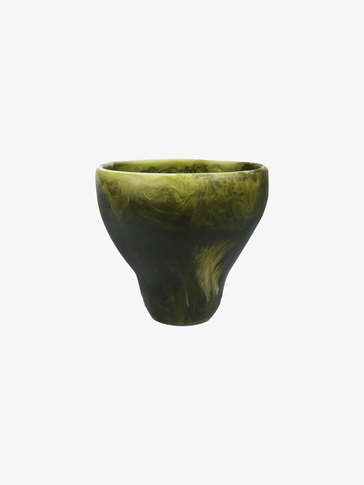
If using a more subtle monochrome palette, make sure you include textural differences in your styling items to create interest - marble, resin, brass, glass, timber etc.
Not everything has to match. In general when you try too hard to match everything it ends up looking very odd. Add in a small amount of unexpected colour to help give the styling composition a point of view.
If you are looking to refresh a room in your house, I hope the above tips help you to get started. Do some planning first and wait to find the things you really love and will want to keep before you hit the shops.

