French House : Sejour
Today’s post is all about the sejour. What is a sejour, I hear you ask? It’s basically the entrance room. Until recently I called this room the ‘top living room’ because I’m basic and don’t speak French and it’s the living area at the front of the house by the front door so ‘top living room’ made sense - even if it didn’t roll off the tongue. But with (French speaking) Leanne helping me who in turn is speaking to the contractors (who are also French - crazy, I know) and the floor plans referring to this room as the ‘sejour’ - I realised pretty quickly that I needed to get on board with being fancy, so that’s what I’ve started calling it too. I mean, at this point I’m practically French.
the sejour layout
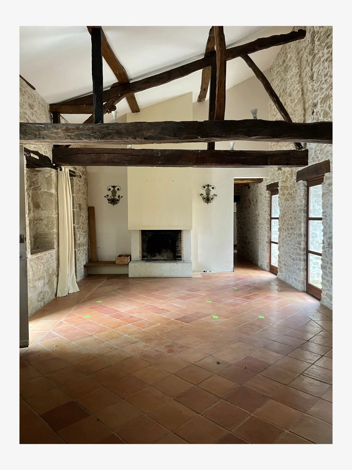
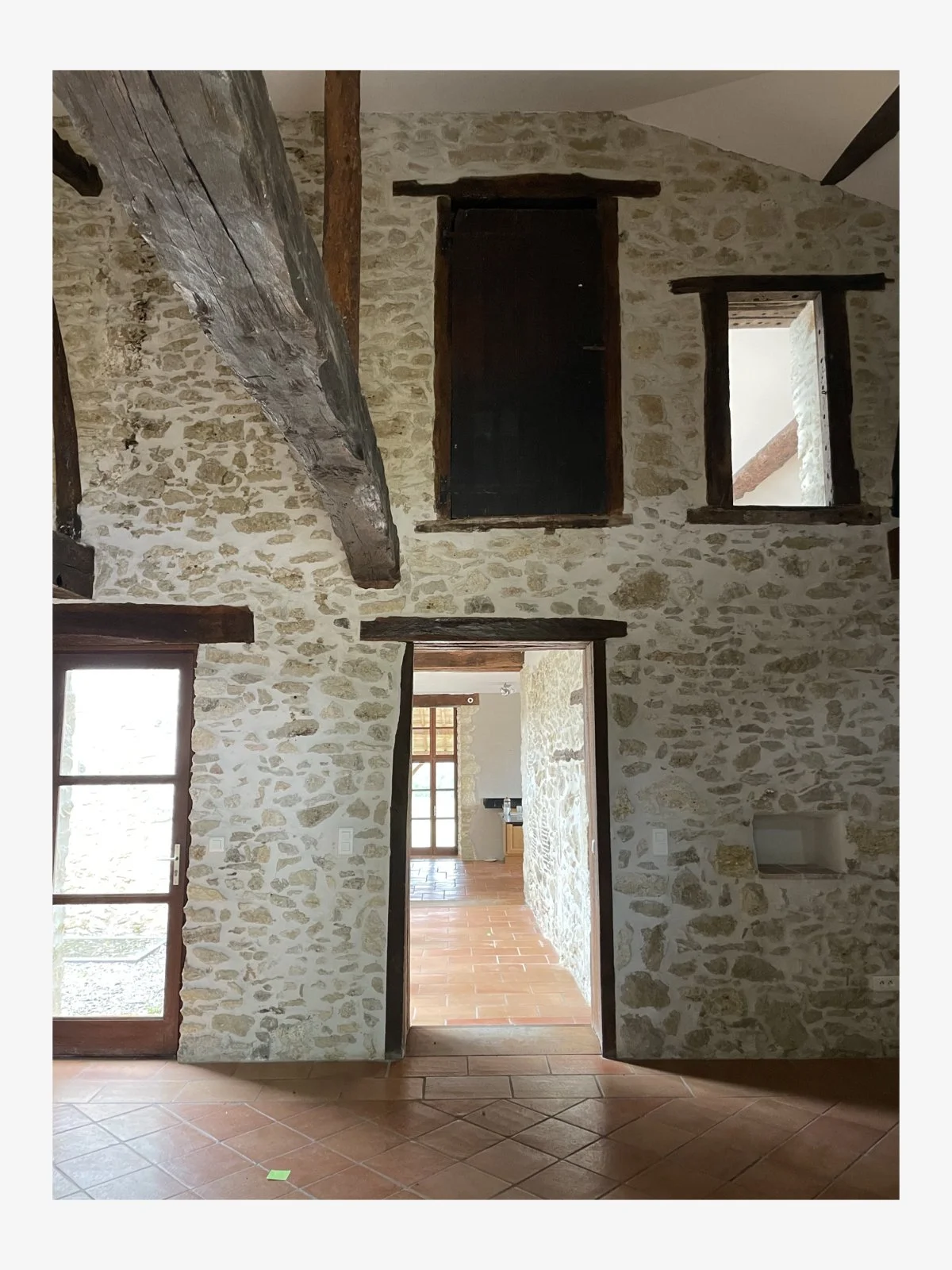
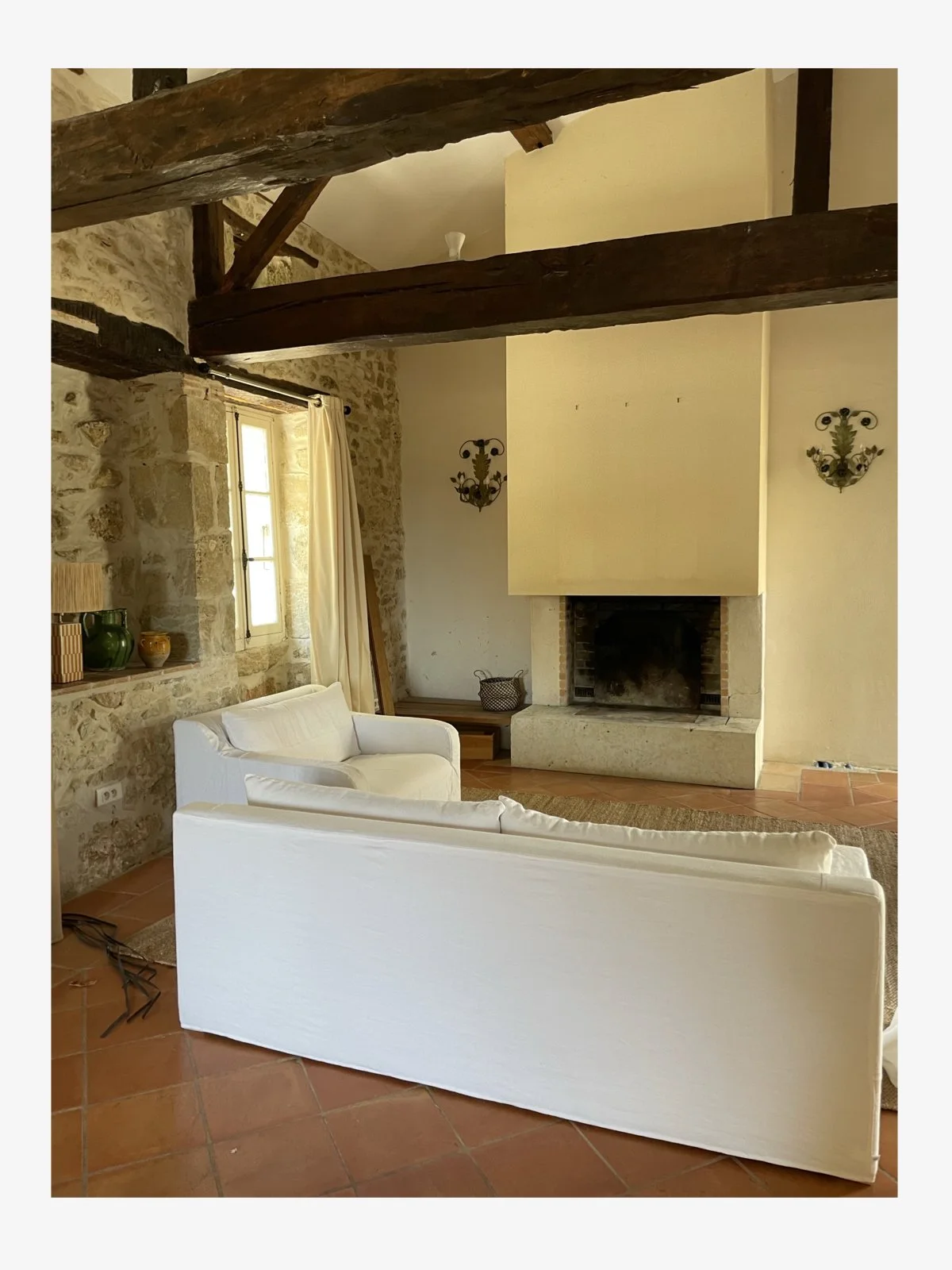
The sejour is a narrow long room with high ceilings and exposed beams which dominate the space due to their low position and dark timber. At one end there is a fireplace, flanked by two wall sconces beside which is the start of the hallway to some of the bedrooms. The front door opens on to this room and is located halfway down one of the long walls - opposite it is the doorway to another hallway which leads into the main part of the house. There are glass doors to one side of this doorway which have a view of the internal courtyard but otherwise, the remaining walls are all stone. There are some pretty quirky elements in this room which indicate its previous life as a dwelling for animals. For instance, there is a door very high up in the sejour in the middle of the wall that I’m guessing was used for moving hay? (Who knows, but given it’s almost at the ceiling I’m pretty sure it wasn’t where the cows were kept).
I have planned the sejour so that there is a living area by the fire and then at the other end of the room, a dining area. This is the same layout that the previous owners had and it makes sense. In essence, this is a room but it’s also a walkthrough space with three different entry exit points. (To see how this room looked when the previous owners lived here, go back to the first France house post where you’ll find a video).
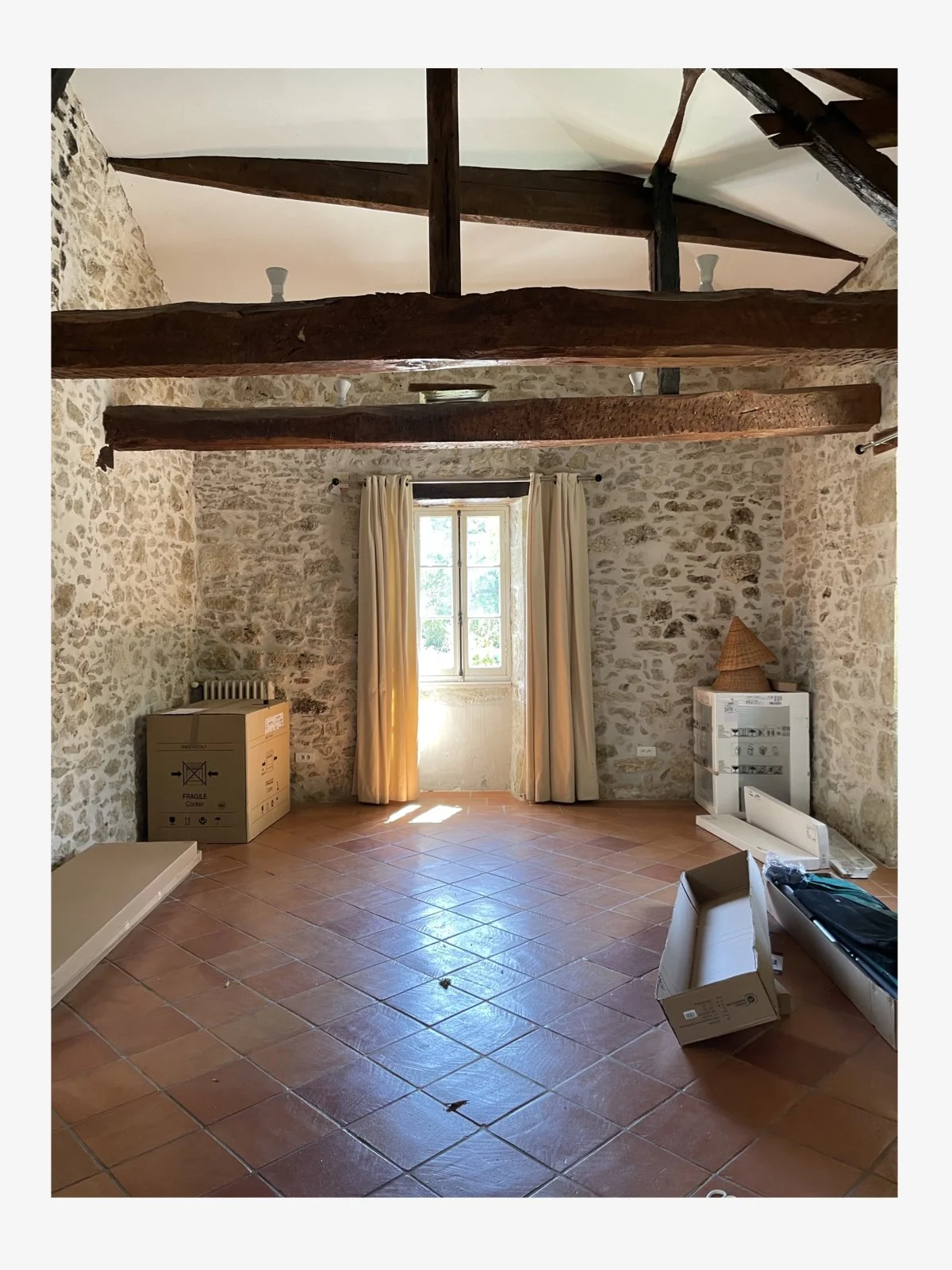
Like all the rooms in this farmhouse, the walls are stone and the floor is terracotta tiles - which are newish (they’re probably 20 years old) so sadly they’re not ye-olde-world-patina-pinterest-worthy terracotta tiles. I can live with them. Only just.
a lack of light
The position of this room faces south so it doesn’t get any direct sun. The windows are original - small casement windows with timber shutters on the outside which don’t let a huge amount of light in even in the middle of the day. Within the room there are glass doors that lead to an internal courtyard but as this courtyard is walled off, no direct sunlight enters through the doors either. All this to say, the room is kind of dark. Even in the middle of the day there is a gloominess to the space, so I wanted to keep that in mind when I was considering what to do.
the plan
Originally I wanted to completely render the main stone wall that faces the front door (the one with the crazy timber door half way up). Given the gloominess and narrowness of the room, I wanted to lighten the feel and create a greater sense of space, and covering over some of the heavy stone would help with this. In an ideal world, I also wanted to blast the beams to remove the dark stain that had been applied (underneath it’s likely the timber is a lovely soft oak colour). These would be big impactful changes to the room and would really help to create a sense of lightness. Neither of these things could or would happen. To start with, rendering over a wall of this size would cost a lot and the French contractor almost had a fit when I suggested it. There was absolute incredulity that I would even think it, let alone suggest it. I got the sense that I might be blacklisted from the town if I went ahead with this madness. Secondly, the beams would be really difficult to blast and the contractor wasn’t sure if the timber would remain in tact through the process. Overall, both of these plans were scotched - for budget and friendly township relations reasons, so I moved on. There was one thing I was definitely going to tackle, the fireplace.
the fireplace
Why it didn’t work…
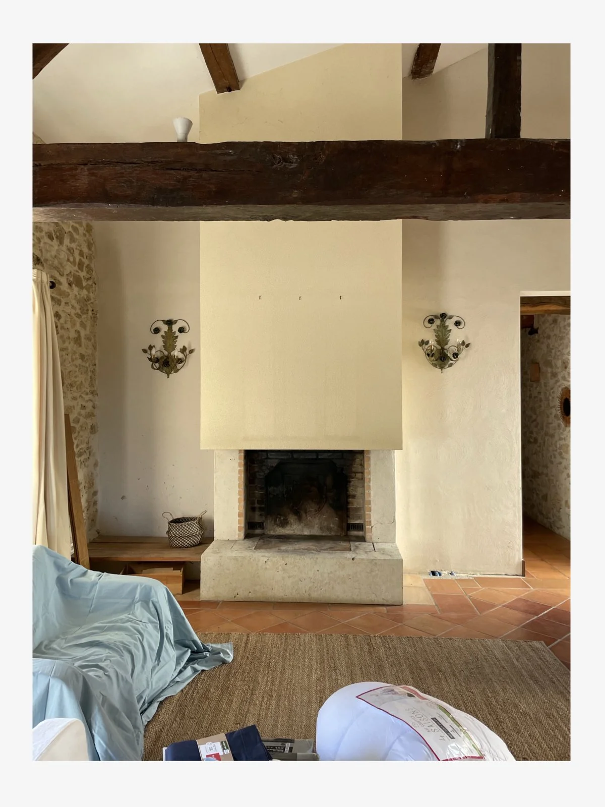
The scale of the fireplace was all wrong for the size of the room and because of the beams overhead, everything felt very cramped with the fireplace almost looming over the living space. Also, the fireplace isn’t original. It was added in the renovations from the previous owners so there was no heritage element to consider. The flue for the fire was housed in a great big plasterboard box that was then rendered with a rough gritty plaster and painted a kind of sand colour. It wasn’t good. The whole thing felt far too large for the space and it was ugly. So, the fireplace had to go. Also, those wall sconces…give me strength! Not only are they not my style (I’m being kind) but they’re not even mounted evenly on the wall. There was no love lost in getting rid of these either.
The solution…
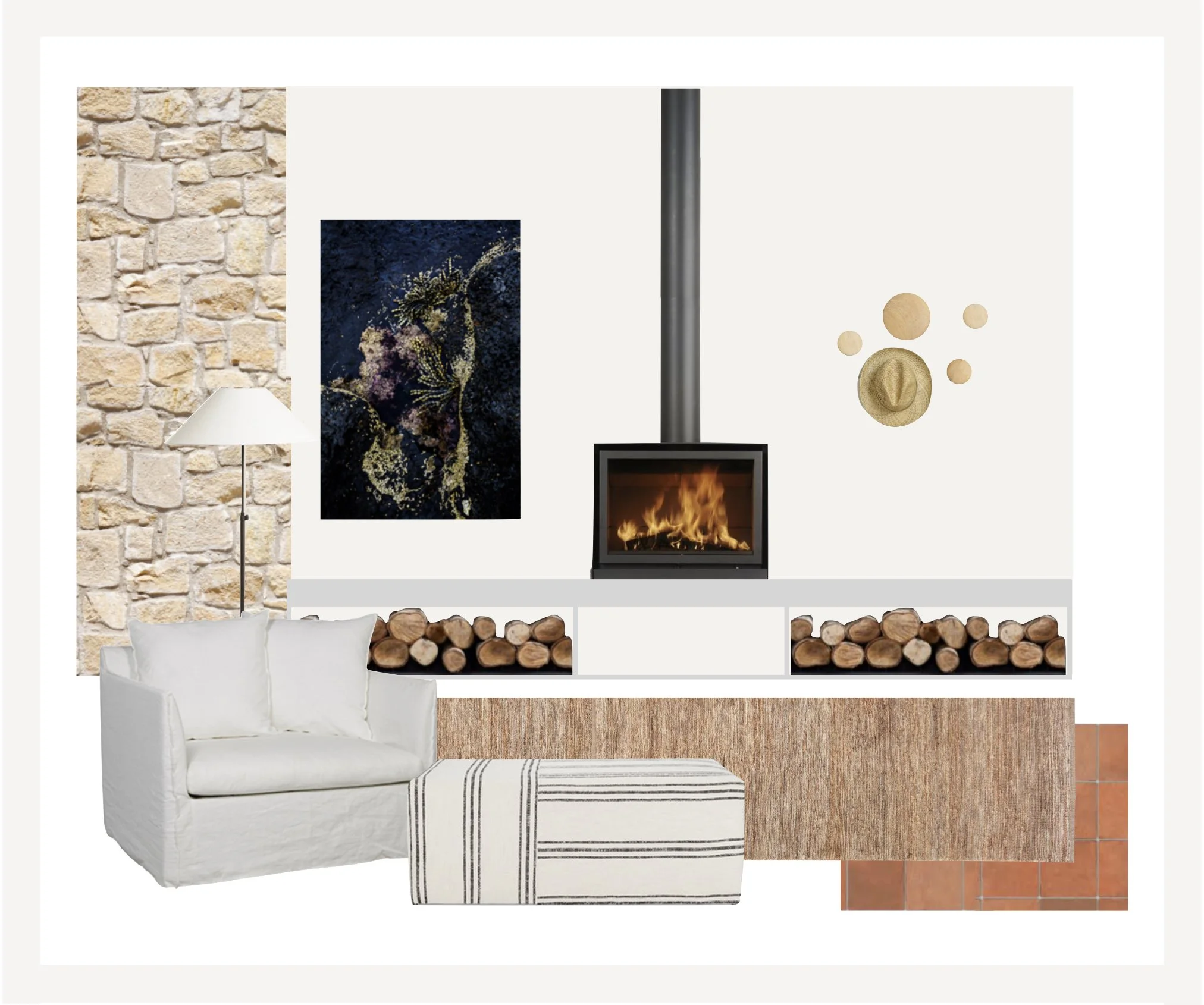
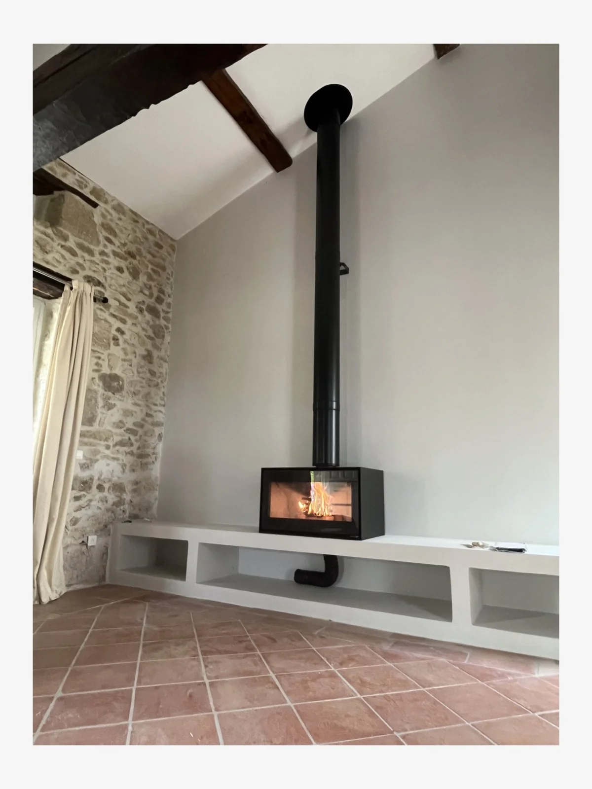
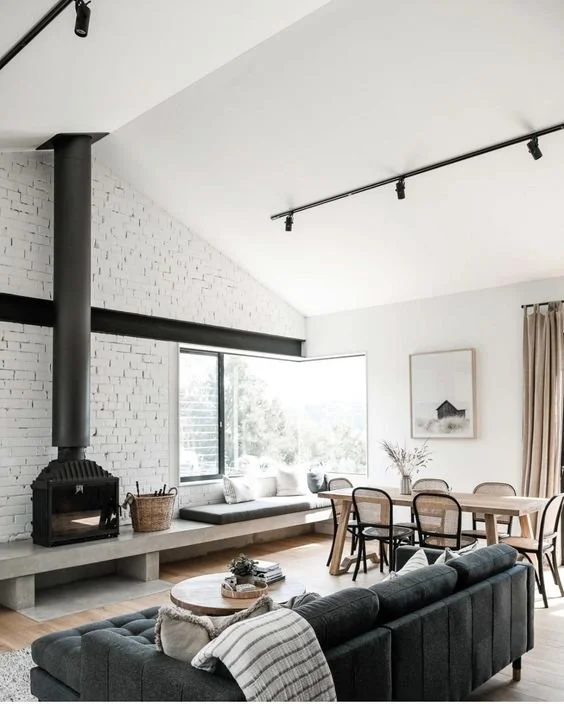
In its place I decided to build a concrete plinth style shelf that would run the length of the wall (this would help to give the illusion of a wider space) and instead of an open fire, I would install a wood burner with an exposed flue. By simplifying the design of this wall, it lightens the room, gives a contemporary upgrade to the heating and creates a greater sense of space. The plinth has cavities underneath for firewood and baskets, and instead of wall lights, I have decided to place art on one side of the wood burner and my favourite Muuto dots on the other.
The Progress…
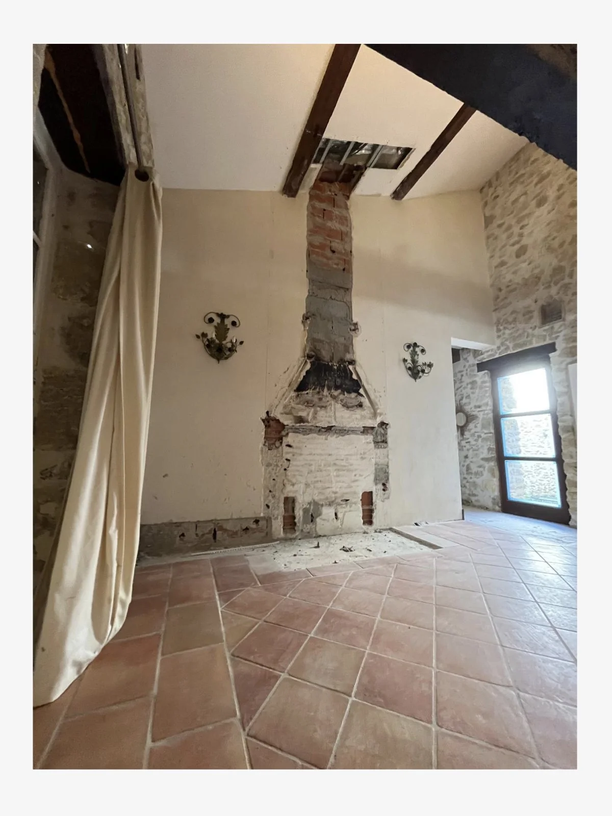
The first task was to rip out the fireplace and flue housing. Then a new wall was created using fire retardant plasterboard which was smooth rendered and painted in Farrow & Ball Strong White. Once this was done, the concrete plinth was created. This was as much as had been completed the last time I saw the house.
Next steps…
To finish the plinth, I needed to decide on a paint colour. Given the construction of the plinth is cement, I could have polished this and left it as is. This look is quite common in modern homes but it wasn’t right for this room. The cold grey of the cement would have added to the coolness of the room and I was trying to lighten everything up. So after some consideration, I decided to use a cement paint from Farrow & Ball in the same colour as the wall. This has now been painted and just last week, the new wood burner has been installed. We paid for the wood burner about a year ago. Its installation was meant to happen about 10 months ago. Here we are at the beginning of May, and it has only just gone in. All I can say is, luckily we haven’t been living in the house during a French winter without heating.
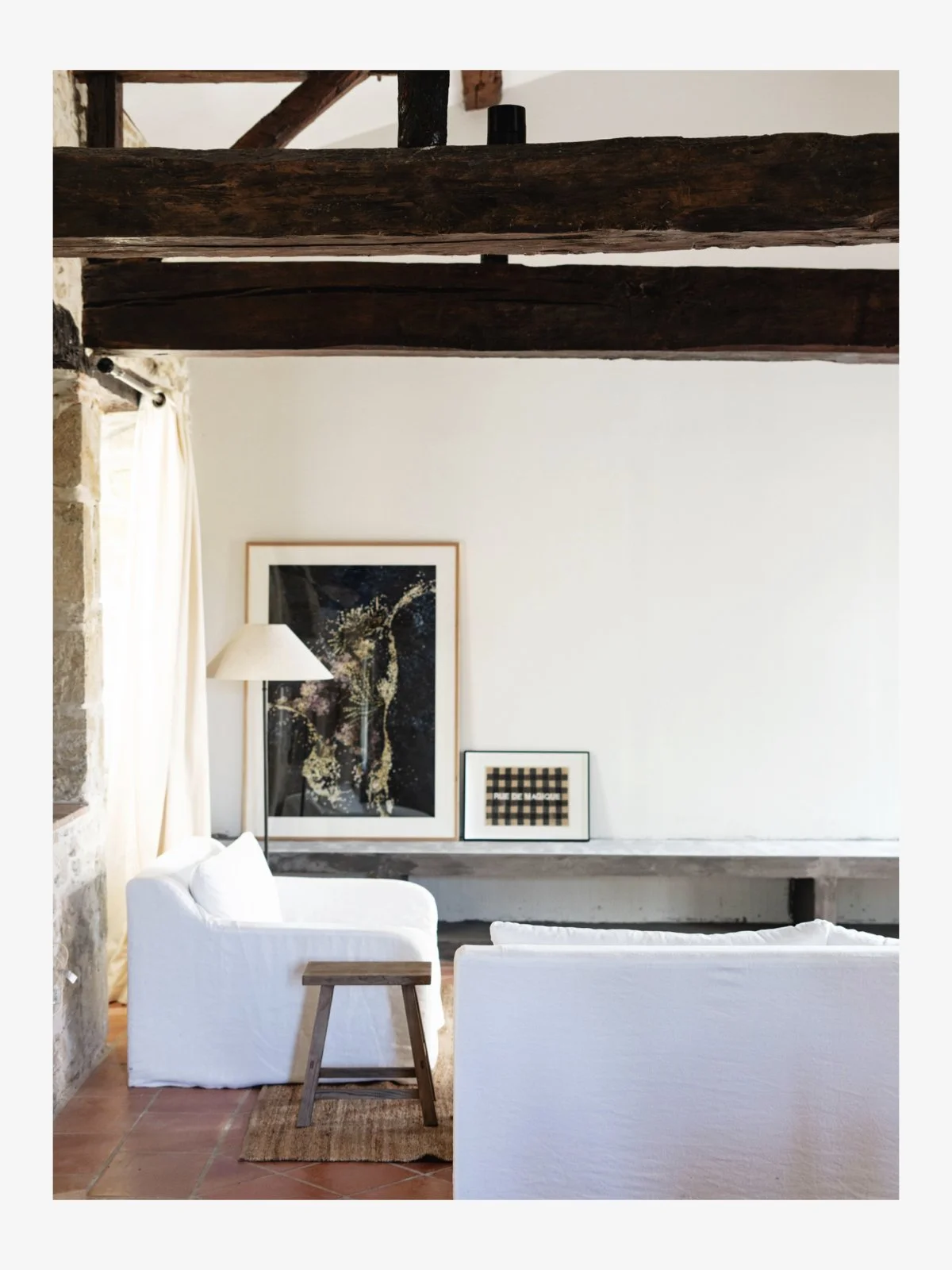
Note: Just as I am finishing off this blog post, Leanne emailed me with the below photo. Yay!! We have a wood burner installed and working and this is the first time I’ve seen the plinth painted. Progress! Apparently the black pipe underneath the plinth will be removed - the wood burner people are coming back. All good.
Finishing Touches
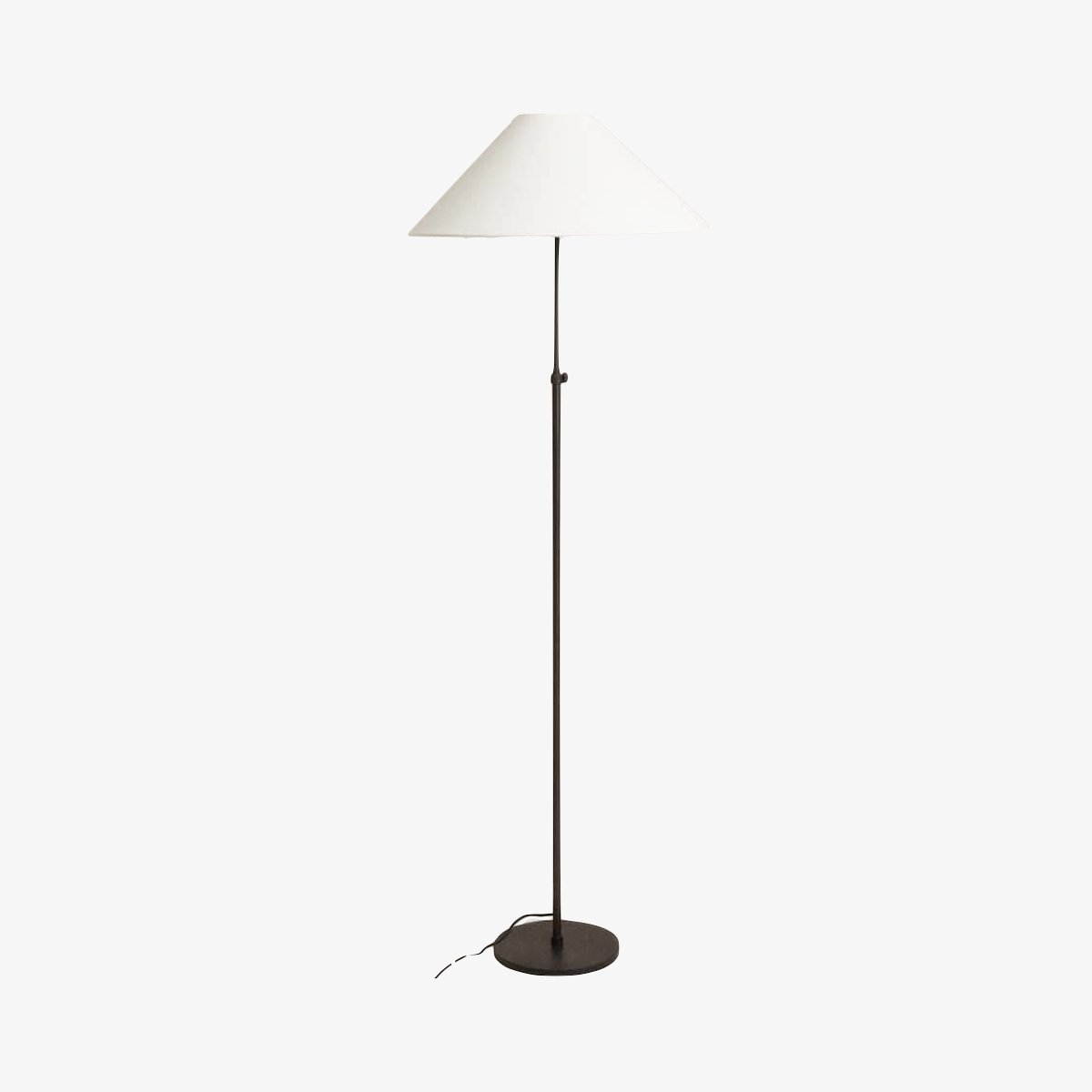
To finish this area I am considering how to style the top of the plinth. I have two options in mind - one is to have some mattress-style cushions made for the plinth top. I have debated this on and off and am still a little undecided. On one hand I like the idea of the plinth being a place you can perch next to the fire and the fabric cushion will add a touch of softness, pattern and colour to the space (which at the moment is needed). On the other hand I love the idea of a clean surface with just a sculptural lamp sitting on top (let’s not forget there are no longer any wall sconces next to the fire so adding in some light is not a bad idea).
I had also considered doing the Castle and Things velvet penny round cushions on the top of the plinth. I love the playful nature of these cushions and the velvet will be a lovely material to add to the room against the stone, linen and sisal. However, I have decided against this because of the Muuto dots. I don’t want to repeat the round motif from the hooks with round cushions underneath on the plinth. Everything is connected (more on this below).
living area furnishings
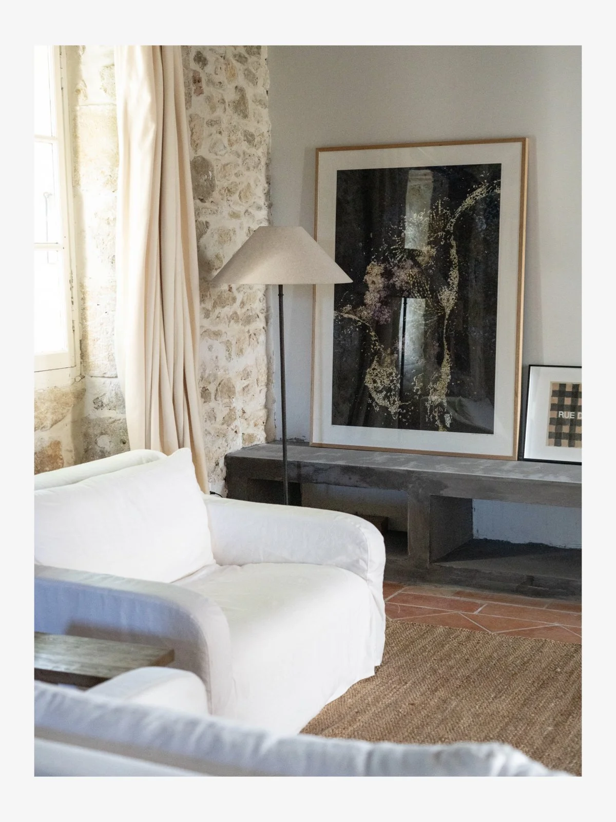
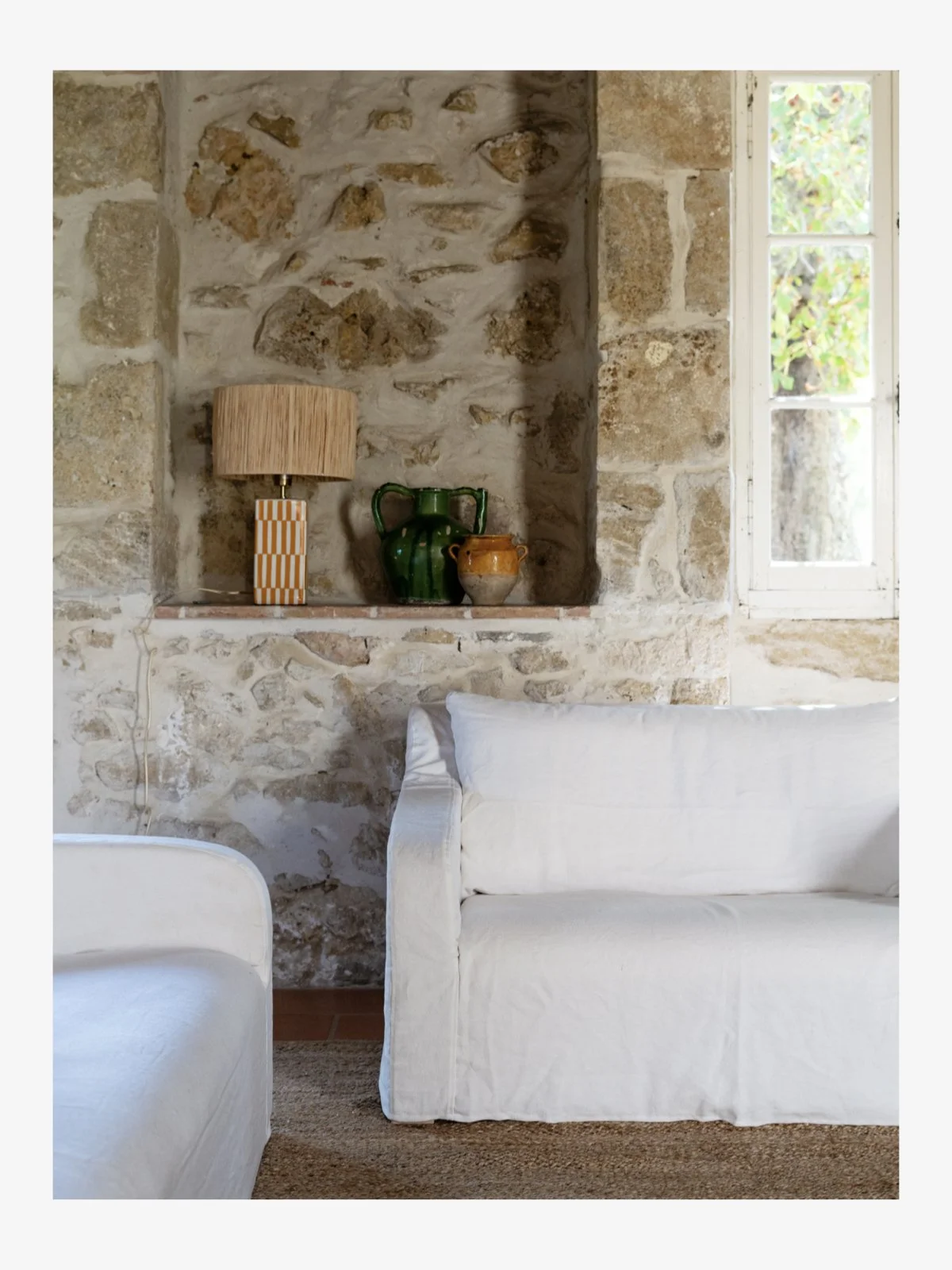
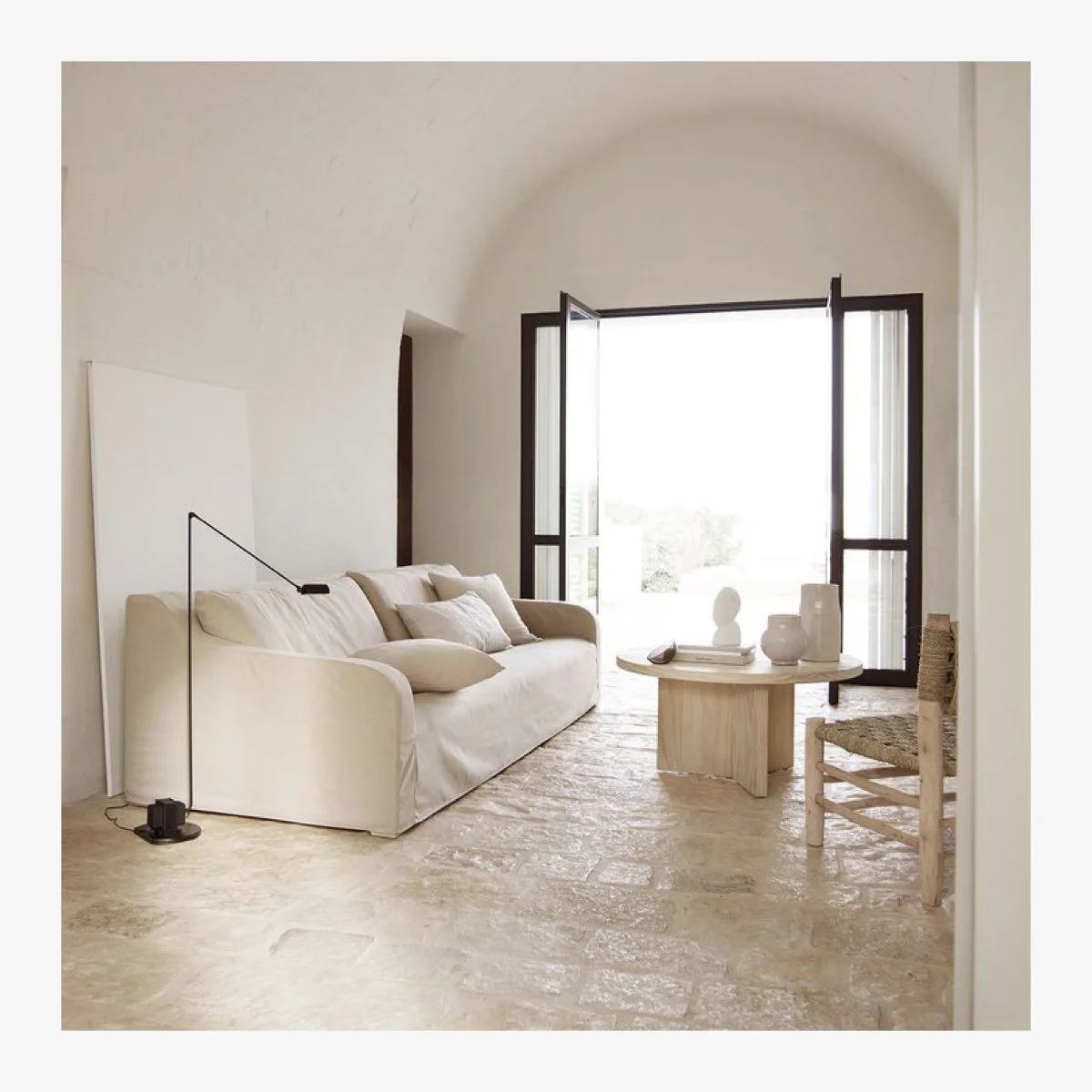
To date I have just minimally furnished this room. Keeping in mind that I wanted to inject a light and airy feel to counteract the gloomy heaviness, I decided on a white linen slip cover sofa and matching armchair from Tine K. I love the streamlined look of this sofa range with its soft curved profile and seamless slipcover. It is a deep sofa and the armchair is love-seat proportions which makes it great to put your feet up and read a book. Even though we don’t use this room as frequently as others in the house, it has already established itself as the ‘quiet’ room and often you can find just one person up there reading. Because of its lack of direct sunlight, the room also stays quite cold, so in summer it is a lovely space for escaping the heat.
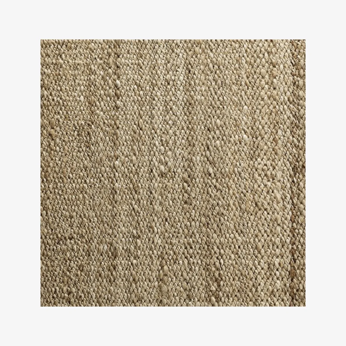
On the floor, I have placed two Tine K sisal rugs - one for the living area and one for the dining.
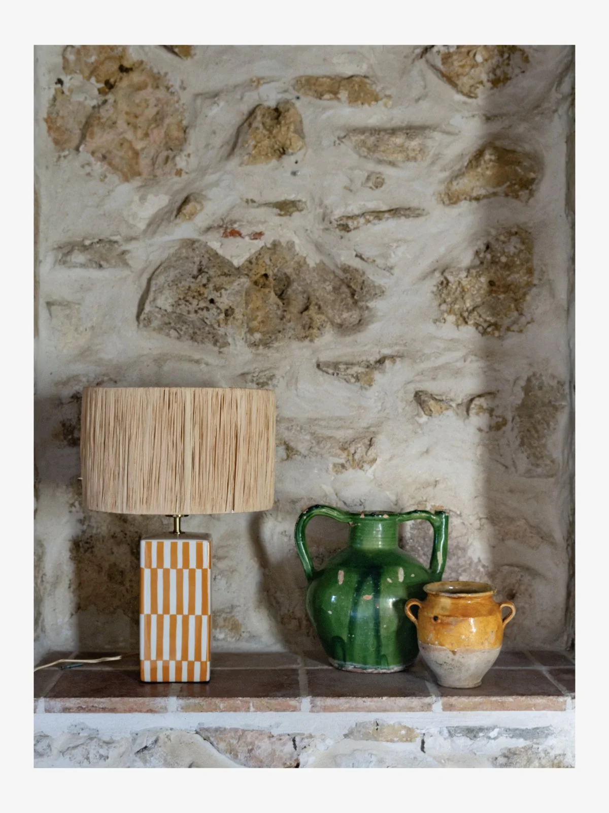
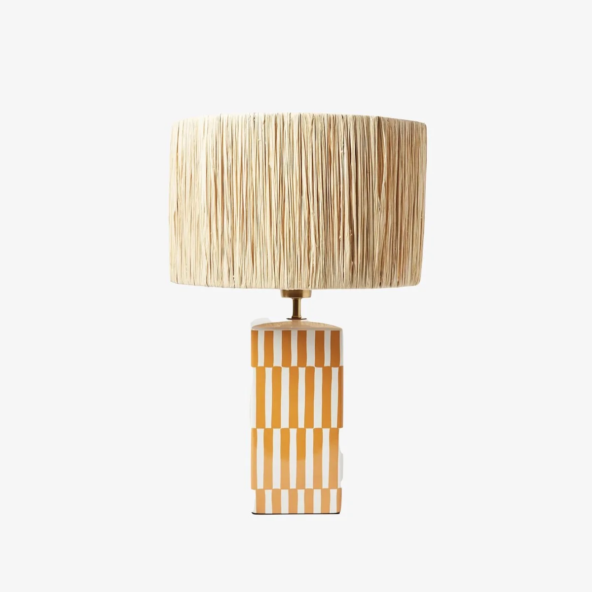
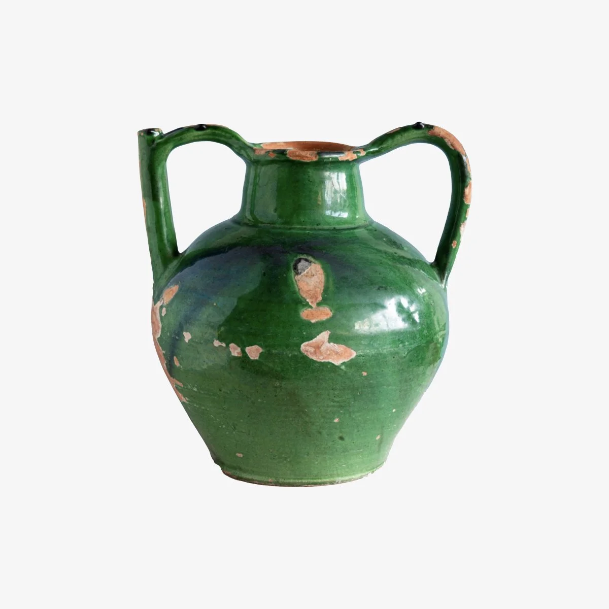
I bought some antique ceramic pots from one of my favourite shops in a town nearby which I have placed on a shelf cut into the wall along with an Oliver Bonas lamp with raffia shade. I like the old ceramics next to the contemporary lamp and the pop of orange and pattern of the lamp adds interest to an otherwise neutral space.
Next steps…
One item I will likely add this year is a coffee table ottoman. I am considering this alongside the mattress cushion decision for the fireplace - in my mind the two items affect one another. Here is my thinking…if I do an upholstered ottoman as a coffee table then it’s likely I won’t do any mattress cushions on top of the plinth. It will simply be too much fabric and upholstered items and texturally, it will start feeling ‘one note’. I like a balance of textures in a room, so keeping the bare plinth alongside an upholstered ottoman coffee table will make sense. However, if I go for a timber or stone coffee table, then I’ll want to add some softness and fabric texture to the room. This is why you want to think about more than one element at a time. Treat the room as a whole and make decisions with all the pieces in harmony.
The curtains that are currently in the room (and the curtain rods) are left over from the previous owner. The curtains themselves are meh but fine - the curtain rods are terrible! Eventually I will get around to changing both but given I have a whole house to sort out and this item isn’t offensive, or causing a major issue, they stay for the time being.
dining room area
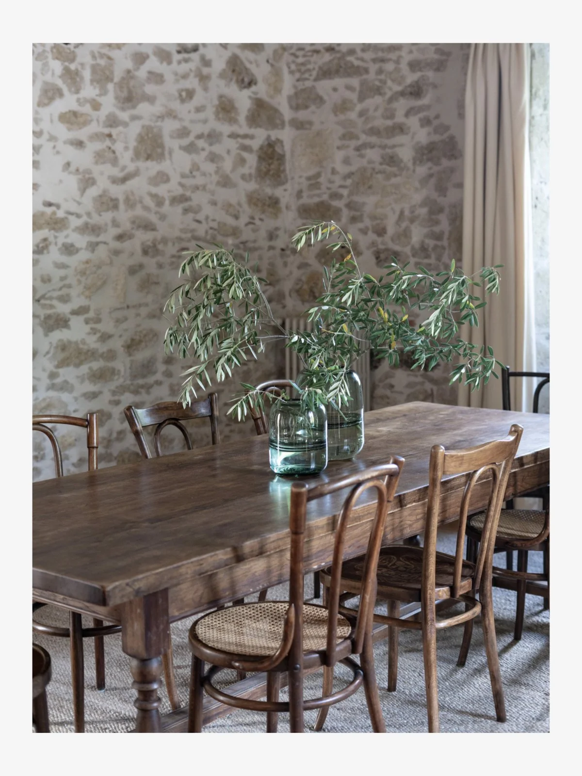
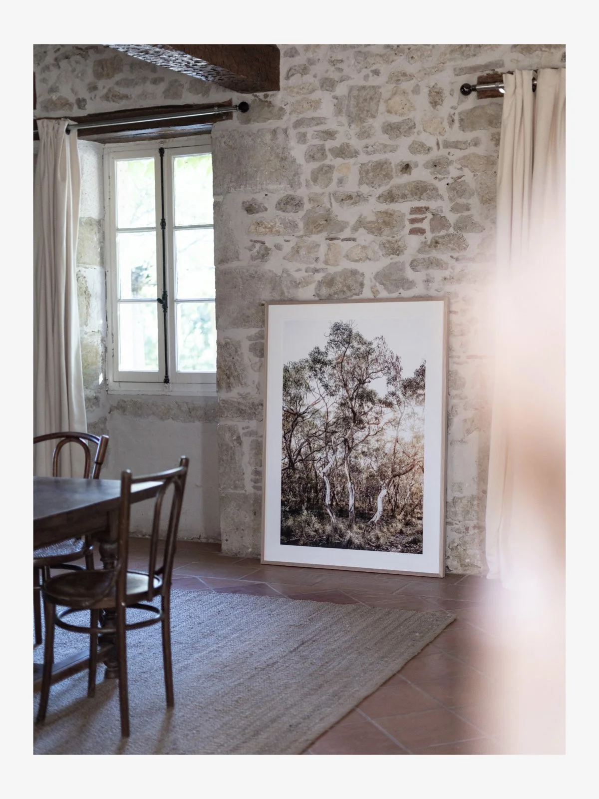
Hmm. All I really needed to do here was to buy a table and chairs. Easier said than done. I went around and around on this decision. I was torn between contemporary oak, simple table and chairs - and something a bit more in keeping with the house. In the end I decided to buy a second hand table and set of mismatched French bistro chairs - all of which I sourced from Selency. I’m kind of happy with it / kind of not. I think the table and chairs are a tiny bit dark for the room and for now, there is nothing else at this dining end of the space to balance them out. At some point I will buy some low side board cabinets to run the length of the stone wall, on top of which I can add a table lamp or two and some objects to dress the space. I will also consider artwork - or perhaps a mirror above the sideboard to let in some more light. Given I have two pieces of large artwork already in this room, I am leaning towards a mirror. In truth, I probably won’t finish this area of the room off until we are spending more time at the house. For now, it has enough in it to not look unfinished - but with plenty of scope for the future. Go slow my friends. Not everything has to be done at once.
SOURCEBOOK
Sourcebook Notes:
The newly rendered wall in the sejour is painted in Farrow & Ball Strong White, Modern Emulsion.
The concrete plinth is painted in Farrow & Ball Strong White, Exterior Masonry.
The woodwork is painted in Farrow & Ball Strong White, Modern Eggshell.
The green pottery above is an item available online - mine were bought from an antiques shop that doesn’t have an online presence so this is an item that is similar
The dining room furniture was bought from Selency France. I can’t connect to their website today so until their website is up, I am making the note here. Once it is back up I’ll add a clickable image to similar pieces.
The green vases on the dining table were sourced in a local town.
The small check artwork sitting on top of the plinth is from Hotel Magique but is no longer available.
INSPIRATION
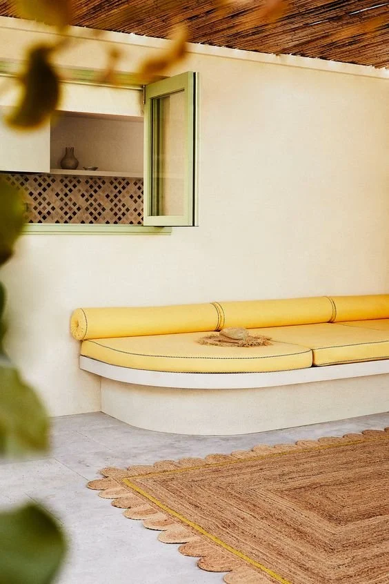
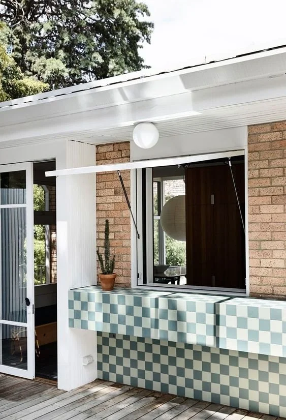
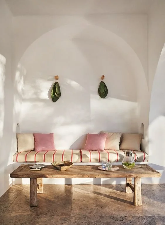
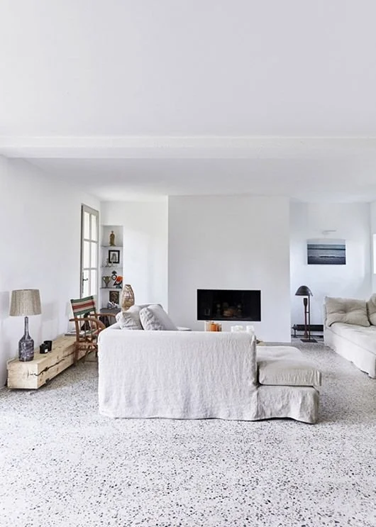
Here are some pins that I saved while looking for inspiration. Some of these images are saved for pattern, colour or treatment of a space. For example, the checkerboard tiling is more a reference for a fabric idea than for the actual tiling itself.

