French House: The First Changes Happen
There are a couple of renovations to any home that can make a big difference. For this house, I started by considering what house-wide changes needed to happen to create the foundation for whatever we wanted to add in or change next. The list was pretty straightforward. It looked like this:
Smooth render all the rough rendered interior walls
Paint all the interior walls
Paint all the woodwork (interior and exterior)
Change the lighting in all the rooms
Add fitted sisal in the bedrooms and study
That was basically it. Alongside these changes were room specific renovations - but this is the list that applied to the whole house and whilst it doesn’t look like a long list, the impact was immense. If we didn’t do anything else, this would be enough.
smooth rendering
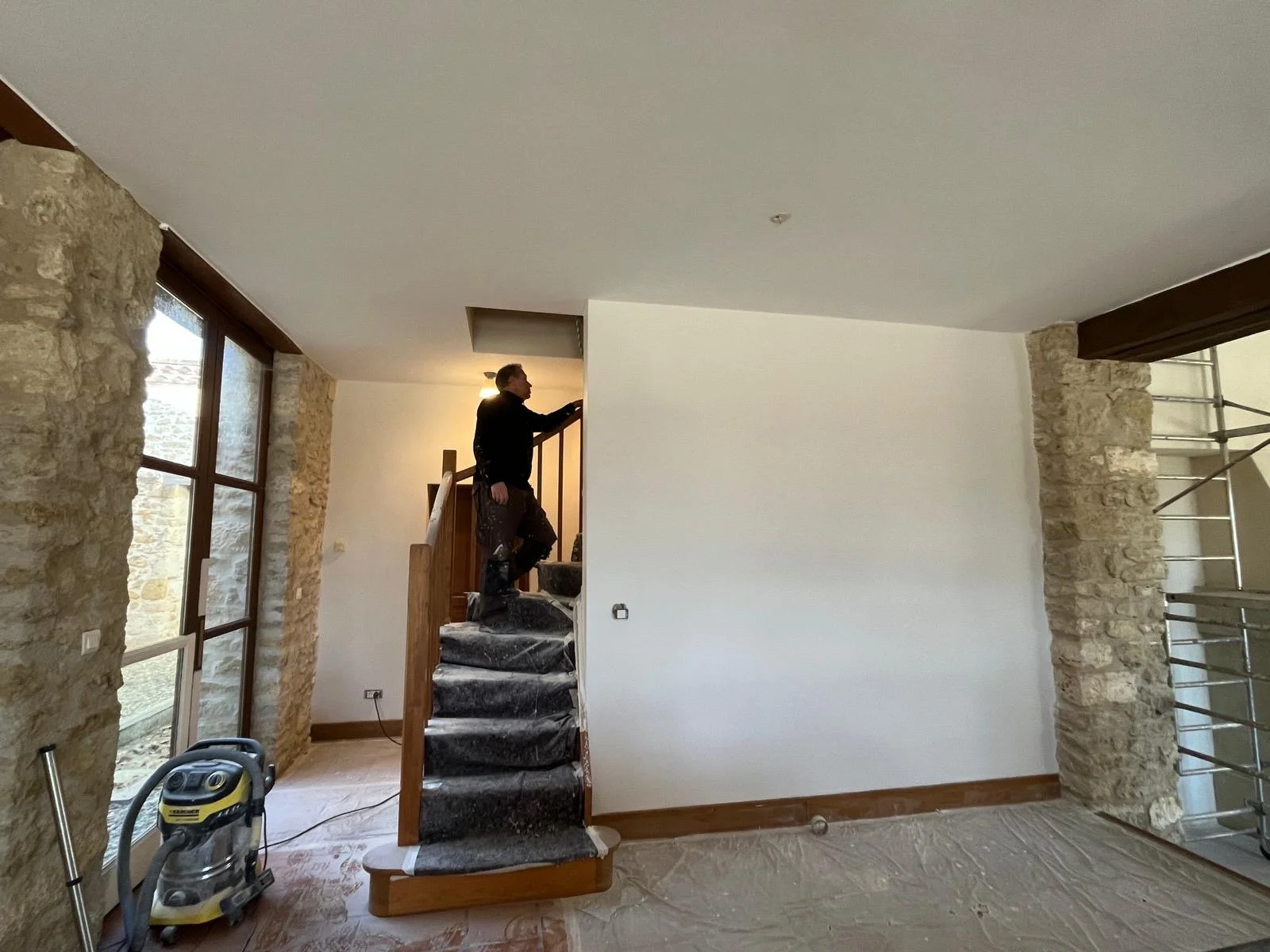
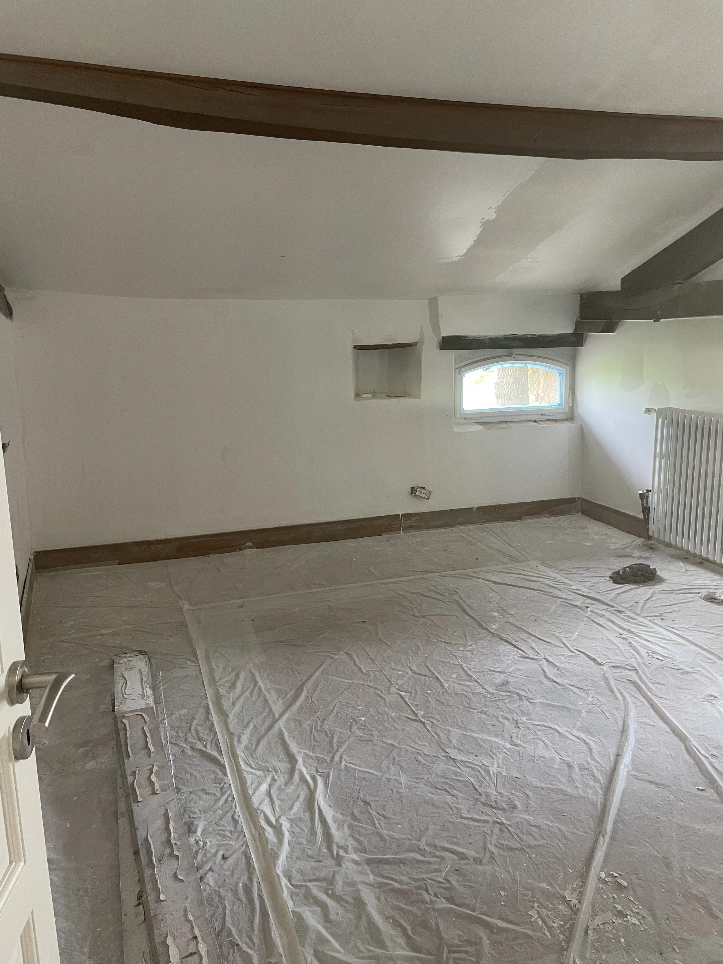
It’s hard for me to separate out which decision had a greater impact - smooth rendering the walls, or changing the paint colour. Either way, both have made a massive difference. The interior walls that aren’t stone had all been finished in a rough sweeping render - it’s a very dated look. You can’t really paint walls with this render, instead, the render itself has a colour that you choose. The previous owners had gone with a kind of sandy creamy beige colour - in the kitchen it’s a kind of mushroom grey brown (it’s so terrible). Anyway, the first task for the painters was to fine render the walls. They are now gloriously crisp and clean and they make a great contrast to the rough stone walls.
choosing a paint colour
The next decision was to choose paint colours. I decided to keep the ceilings as they were - they’re white and I didn’t want the extra expense of painting these as well, as the interior walls and woodwork alone was a lot.
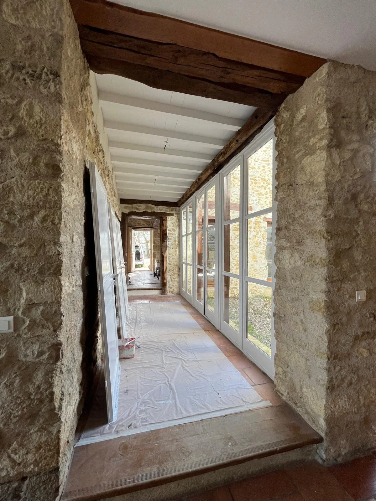
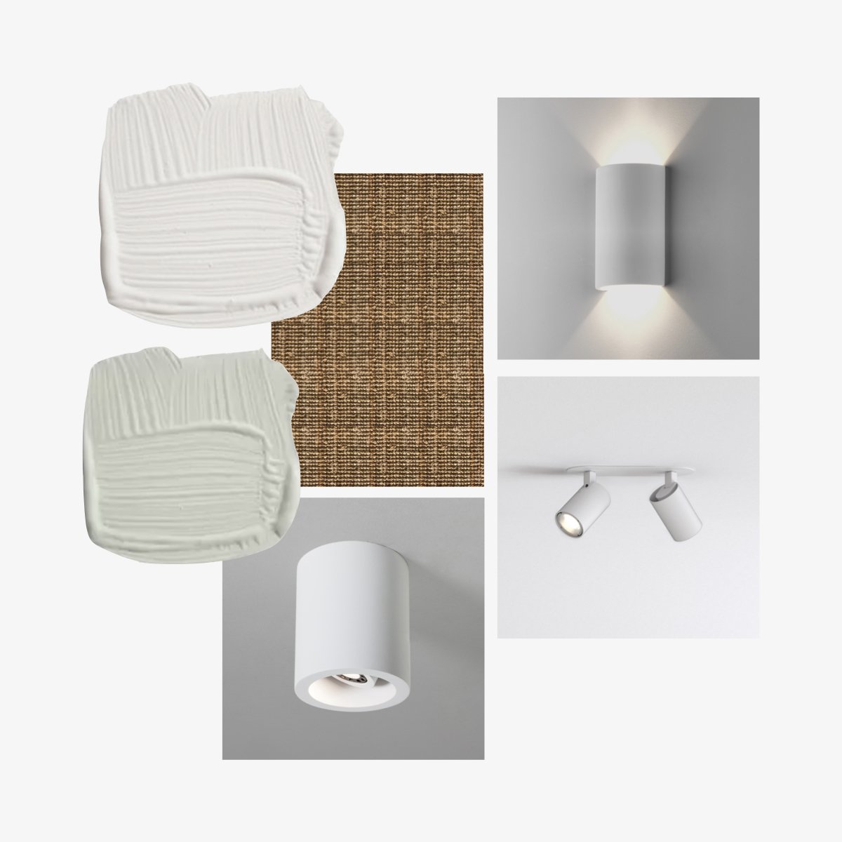
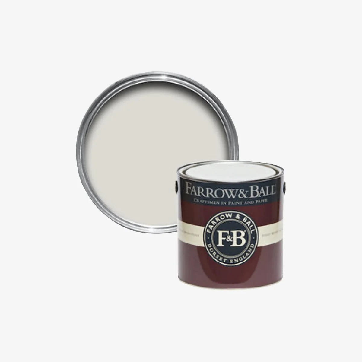
On the first summer that we were there, I went to the local paint shop to get some Farrow & Ball samples. I tested out a range of whites and in the end went with Strong White. It is a greyish white and has a cool clean look to it. Rather than complicate things, I used the same colour throughout with Modern Emulsion on the walls and Modern Eggshell on the woodwork.
The exterior woodwork is painted the same and the timber shutters have been painted in Farrow & Ball Purbeck Stone - an almost identical colour to what was there originally.
fitting new lights
Another big change has been to remove all the old lights and replace them with contemporary ones. The original lighting scheme was completely without any thought. Random light styles were placed all over the home with almost no consideration for where they were placed, if they were even and if they were even appropriate in terms of creating the right level of light for the room. All of them needed to go.
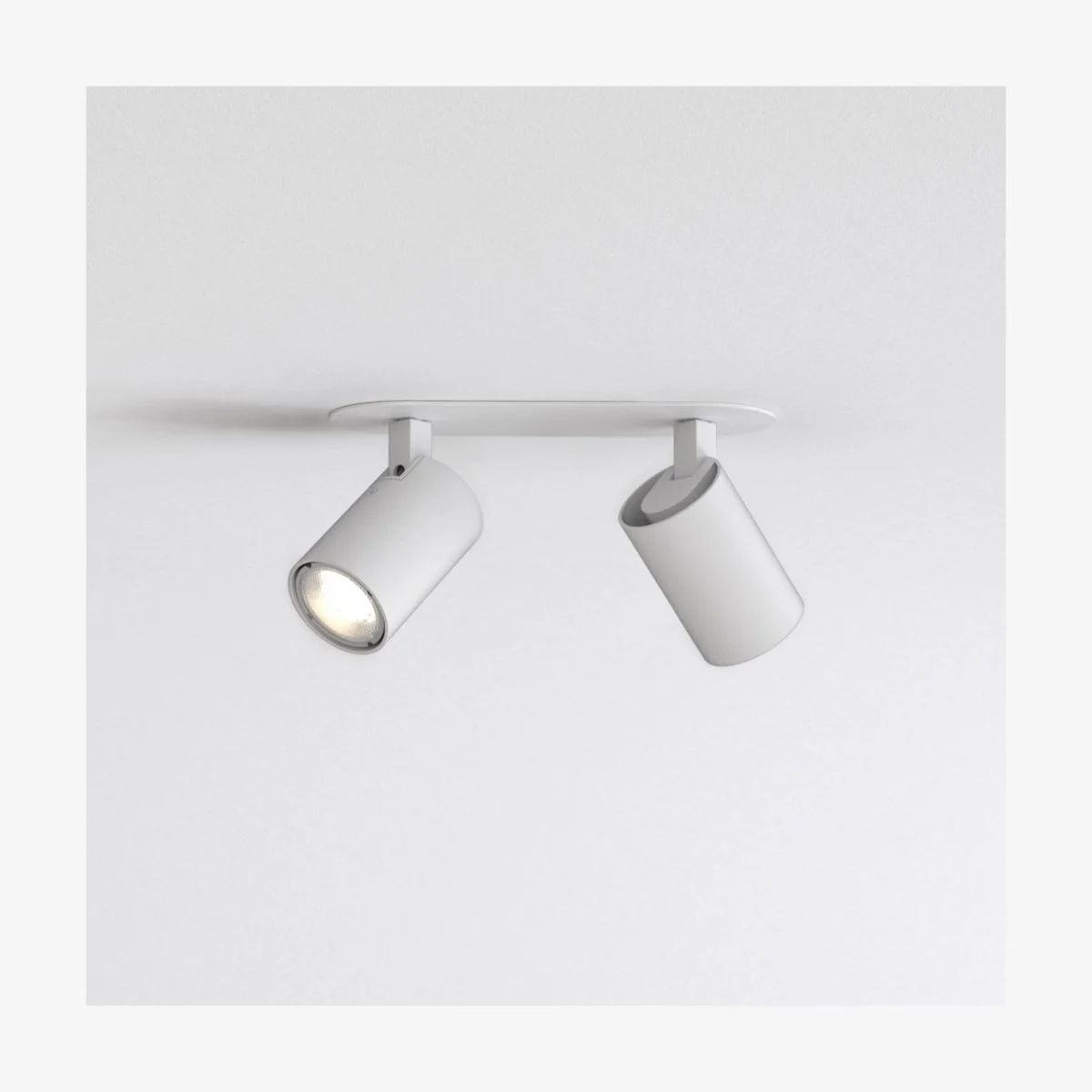
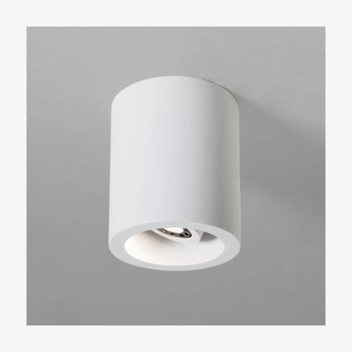
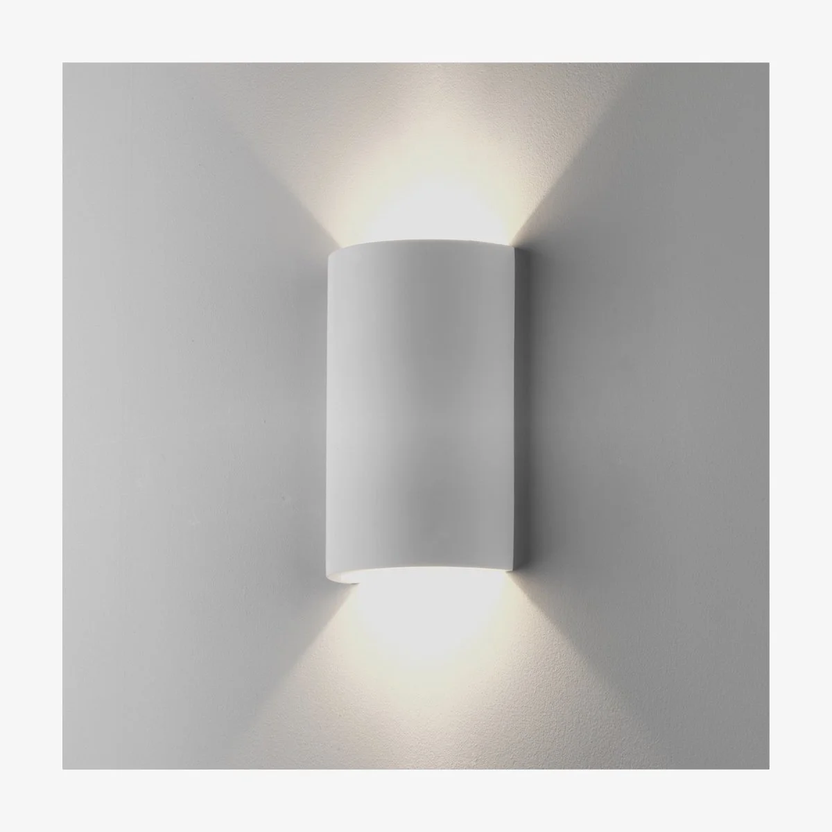
Rather than create a feature out of the lights, I decided almost exclusively to use twin spot lights recessed in the ceiling for the bedrooms and a series of downlights in the hallway that were clean and unobtrusive. In some rooms where the ceiling is concrete, I used wall sconces rather than having to hack into the concrete to mount ceiling lights.
My choice of of lights is not because I don’t love feature lighting. We have a lot of pendant lights in our home in Singapore, but in the French house I didn’t feel like it was needed. There are enough dominate features in the home (the stone walls for one) that I didn’t want anything else to compete visually. So, small and unobtrusive lighting was my plan.
sourcebook
INSPIRATION
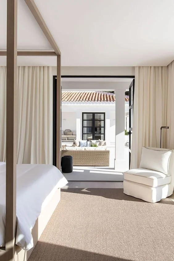
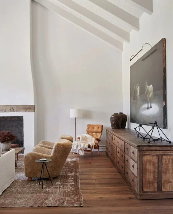
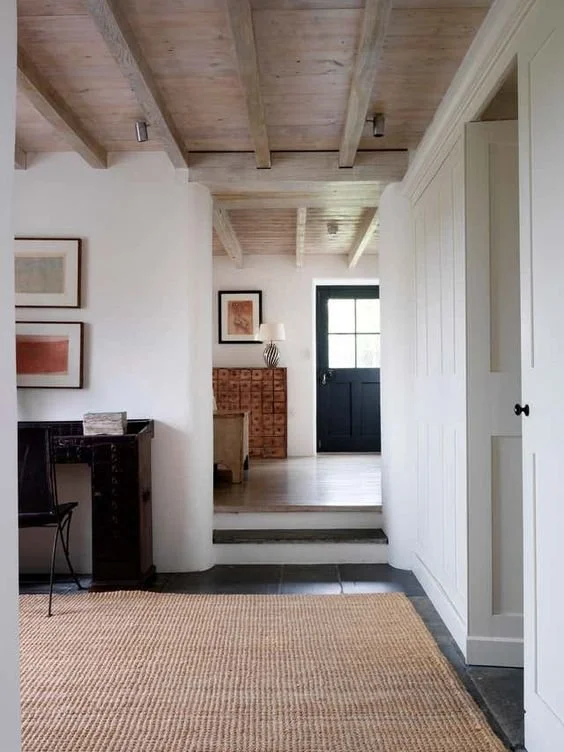
Here are some images that I pinned for inspiration. Most of these are self explanatory - lights, sisal, wall plastering!

